App Portal Redesign
App Portal Redesign
App Portal Redesign
Visit site
Visit site
Role
UX/UI designer
Timeline
2022
Platform
Saas, B2C
Team
UX design team
Visit site
Overview
Overview
Overview
UpBeing is a consumer wellness platform that helps people connect feelings, behaviors, and routines through guided reflection and lightweight tracking. It pairs personalized insights with supportive prompts so users can build self-awareness, stay consistent, and make small changes over time. As a UX/UI Designer, I drove the end-to-end redesign of the application portal, contributing core UX and UI decisions that shaped a more refined and user-centered experience.
UpBeing is a consumer wellness platform that helps people connect feelings, behaviors, and routines through guided reflection and lightweight tracking. It pairs personalized insights with supportive prompts so users can build self-awareness, stay consistent, and make small changes over time. As a UX/UI Designer, I drove the end-to-end redesign of the application portal, contributing core UX and UI decisions that shaped a more refined and user-centered experience.
UpBeing is a consumer wellness platform that helps people connect feelings, behaviors, and routines through guided reflection and lightweight tracking. It pairs personalized insights with supportive prompts so users can build self-awareness, stay consistent, and make small changes over time. As a UX/UI Designer, I drove the end-to-end redesign of the application portal, contributing core UX and UI decisions that shaped a more refined and user-centered experience.
Role
Role
UX/UI designer
UX/UI designer
Timeline
Timeline
2022
2022
Platform
Platform
SaaS, B2C
SaaS, B2C
Team
Team
UX design team
UX design team
Problem
Problem
Problem

UpBeing had early traction in its beta stage, but the product’s UI and interaction patterns didn’t yet match the brand’s re-launch or the maturity users expected. The team needed a clearer system for consistency, usability, and long-term growth.
UpBeing had early traction in its beta stage, but the product’s UI and interaction patterns didn’t yet match the brand’s re-launch or the maturity users expected. The team needed a clearer system for consistency, usability, and long-term growth.
UpBeing had early traction in its beta stage, but the product’s UI and interaction patterns didn’t yet match the brand’s re-launch or the maturity users expected. The team needed a clearer system for consistency, usability, and long-term growth.
Solution
Solution
Solution


I partnered with the founder/team to strengthen the core experience by improving clarity, data tracking, and light gamification while preserving UpBeing’s people-centered tone. The work included:
A joint heuristic evaluation to pinpoint usability and accessibility gaps.
A refreshed visual system (type, color, components) to support consistency.
Iterative UI updates across key flows to improve comprehension and completion.
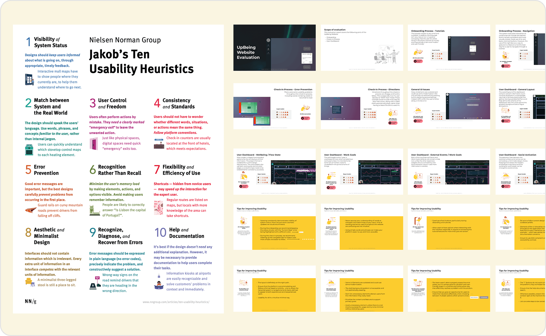
Research & analysis
Research & analysis
Research & analysis
Before deep-diving into the process, UpBeing’s beta portal and its functionality were graded via a heuristic evaluation.
Before deep-diving into the process, UpBeing’s beta portal and its functionality were graded via a heuristic evaluation.
Before deep-diving into the process, UpBeing’s beta portal and its functionality were graded via a heuristic evaluation.
Heuristic evaluation
Heuristic evaluation
Heuristic evaluation
The audit used Jakob Nielsen’s principles to evaluate the existing experience. Key friction points included contrast and readability issues, inconsistent language, limited user control, and accessibility gaps.
The audit used Jakob Nielsen’s principles to evaluate the existing experience. Key friction points included contrast and readability issues, inconsistent language, limited user control, and accessibility gaps.
The audit used Jakob Nielsen’s principles to evaluate the existing experience. Key friction points included contrast and readability issues, inconsistent language, limited user control, and accessibility gaps.
Design explorations
Design explorations
Design explorations
I synthesized insights from evaluation and prior UX work to guide the design phase. I contributed to a refreshed style guide that established accessible design foundations while aligning with UpBeing’s brand and people-centered voice.
I synthesized insights from evaluation and prior UX work to guide the design phase. I contributed to a refreshed style guide that established accessible design foundations while aligning with UpBeing’s brand and people-centered voice.
I synthesized insights from evaluation and prior UX work to guide the design phase. I contributed to a refreshed style guide that established accessible design foundations while aligning with UpBeing’s brand and people-centered voice.
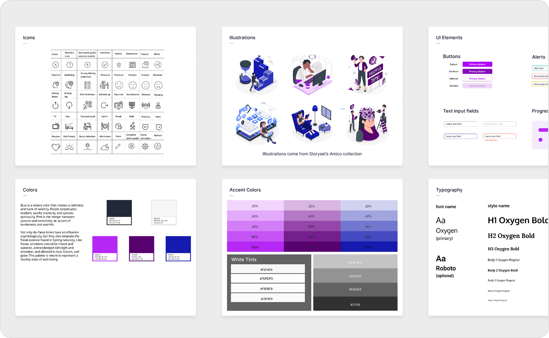
Style guide & visual system
Style guide & visual system
Style guide & visual system
A style guide was established to set accessible design parameters while staying true to the founding brand identity.
A style guide was established to set accessible design parameters while staying true to the founding brand identity.
A style guide was established to set accessible design parameters while staying true to the founding brand identity.
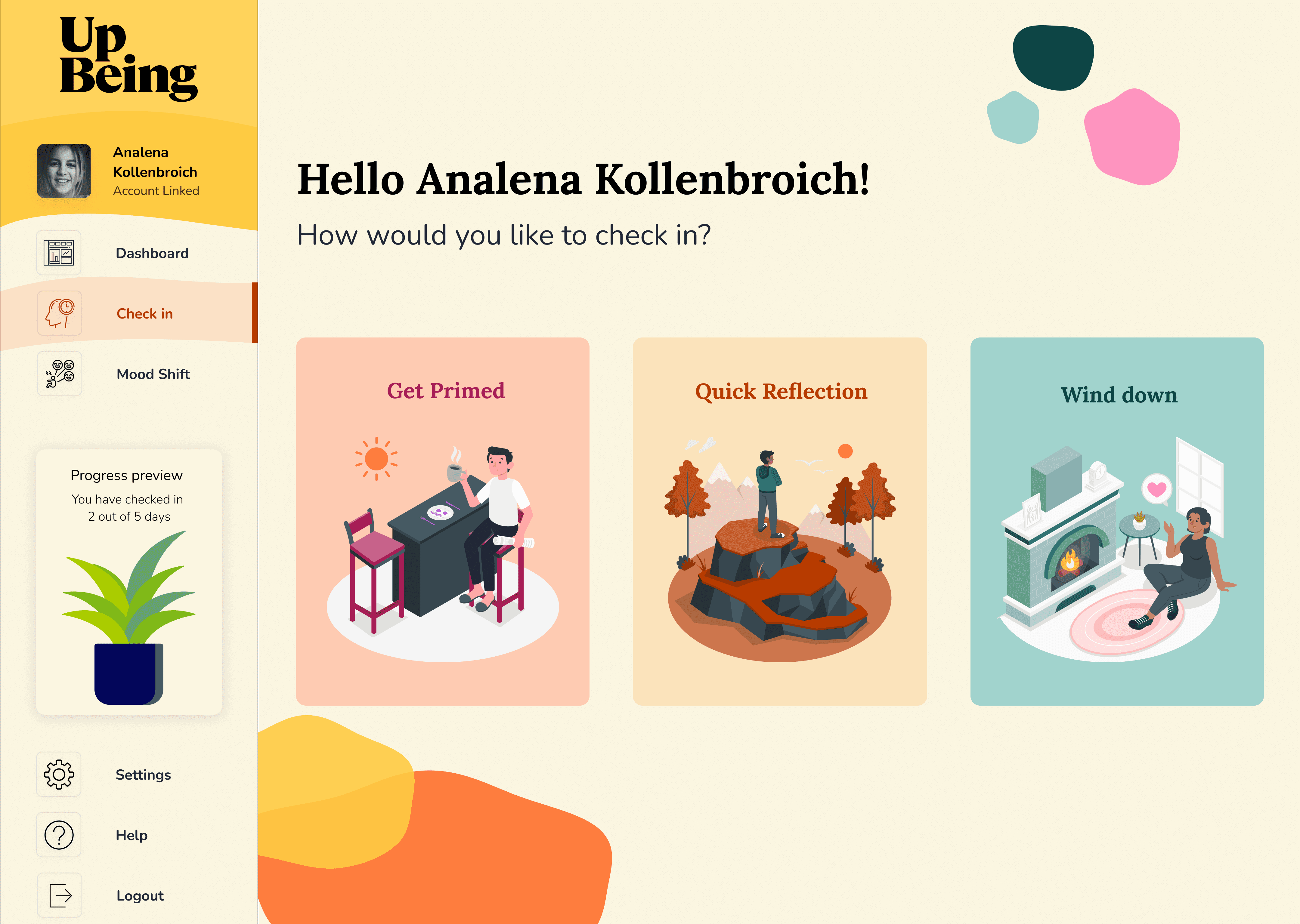
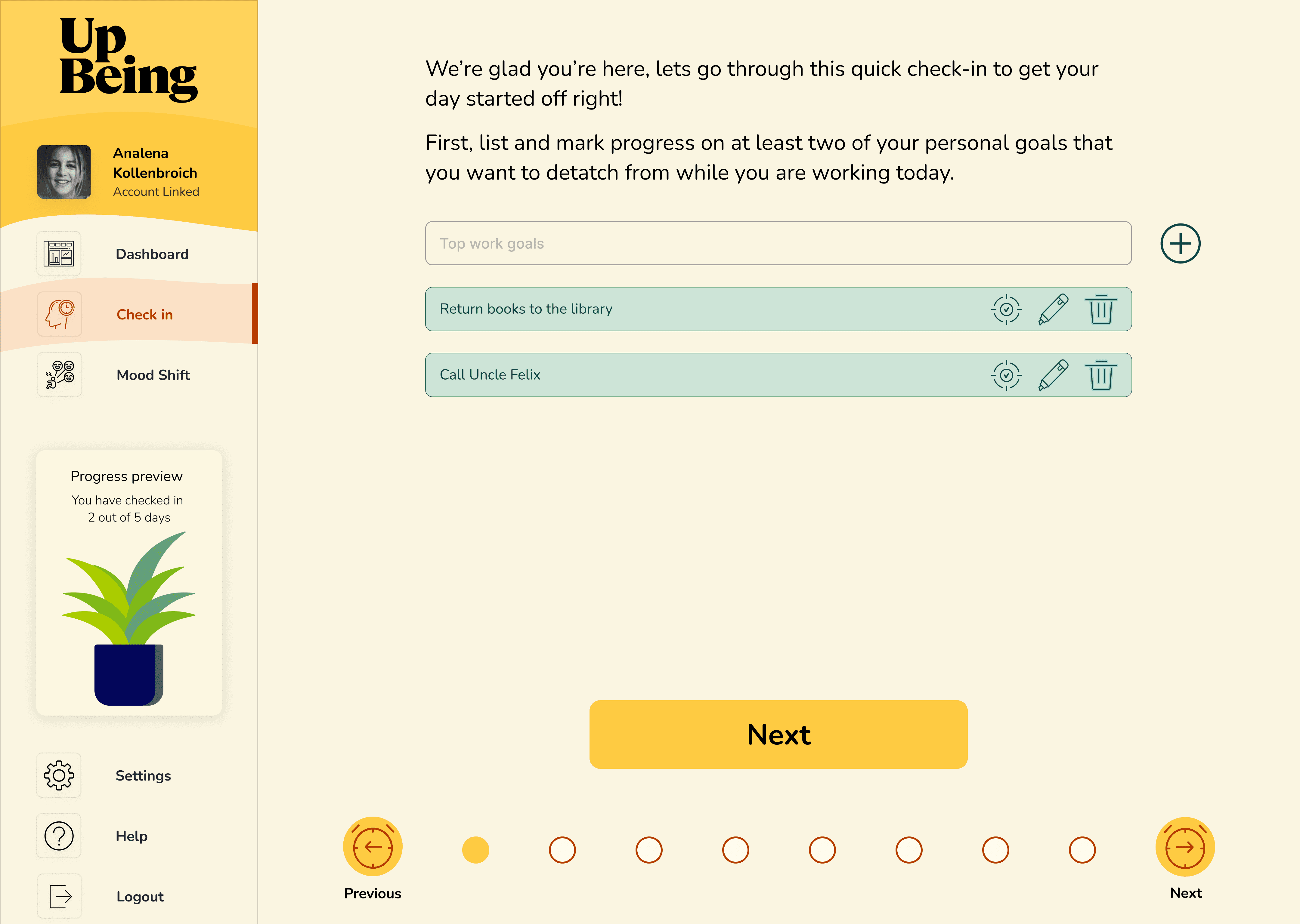
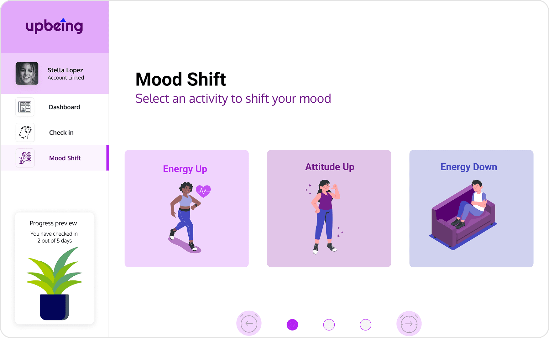
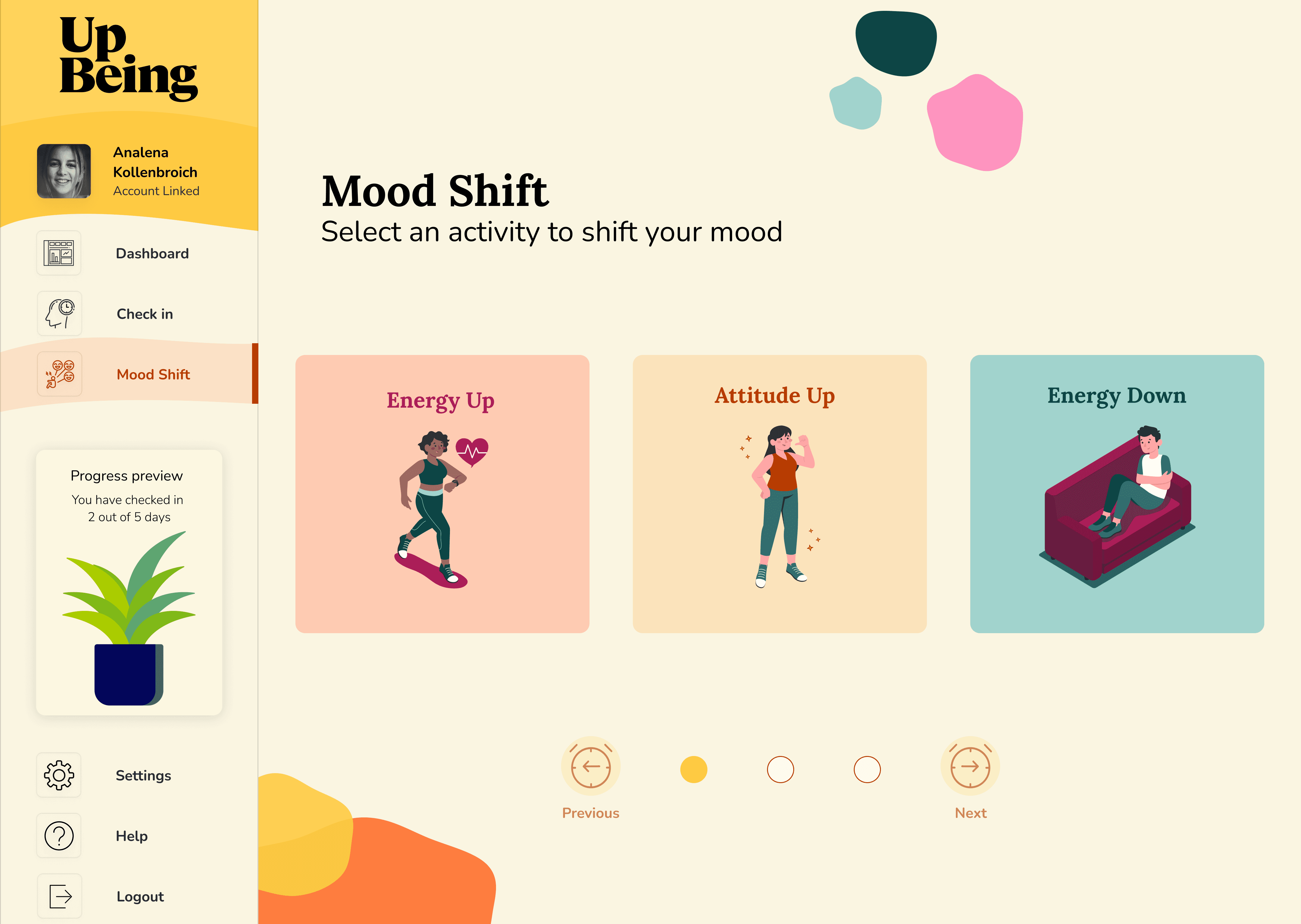
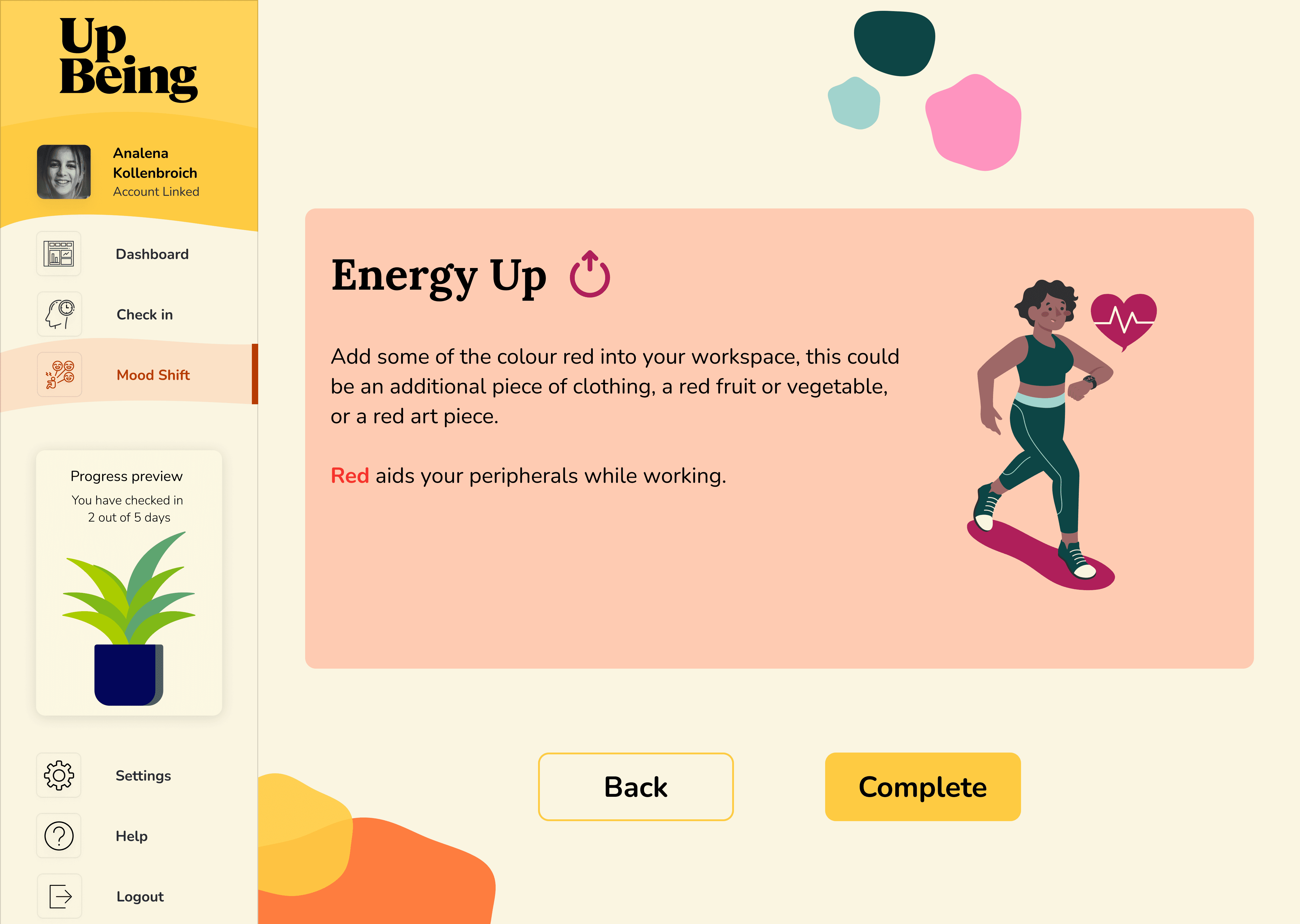
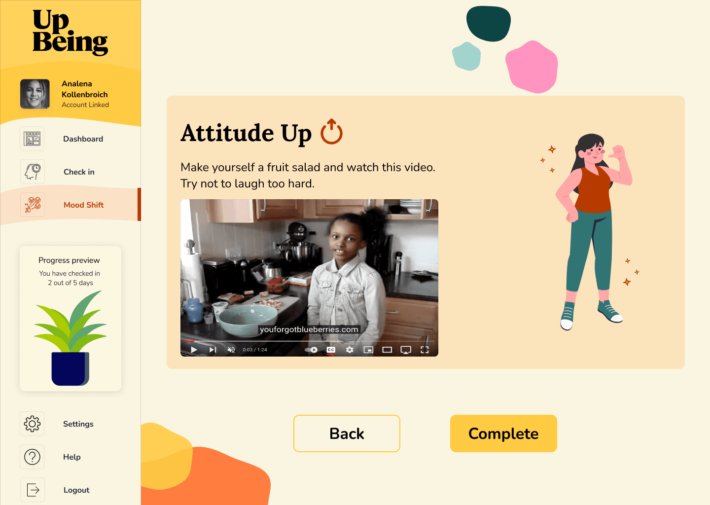
Mood shift activities workflow
Mood shift activities workflow
Mood shift activities workflow
I expanded the Mood Shift workflow with key visual changes such as:
Upgraded components and iconography.
Interactions to match user expectations.
I expanded the Mood Shift workflow with key visual changes such as:
Upgraded components and iconography.
Interactions to match user expectations.
I expanded the Mood Shift workflow with key visual changes such as:
Upgraded components and iconography.
Interactions to match user expectations.
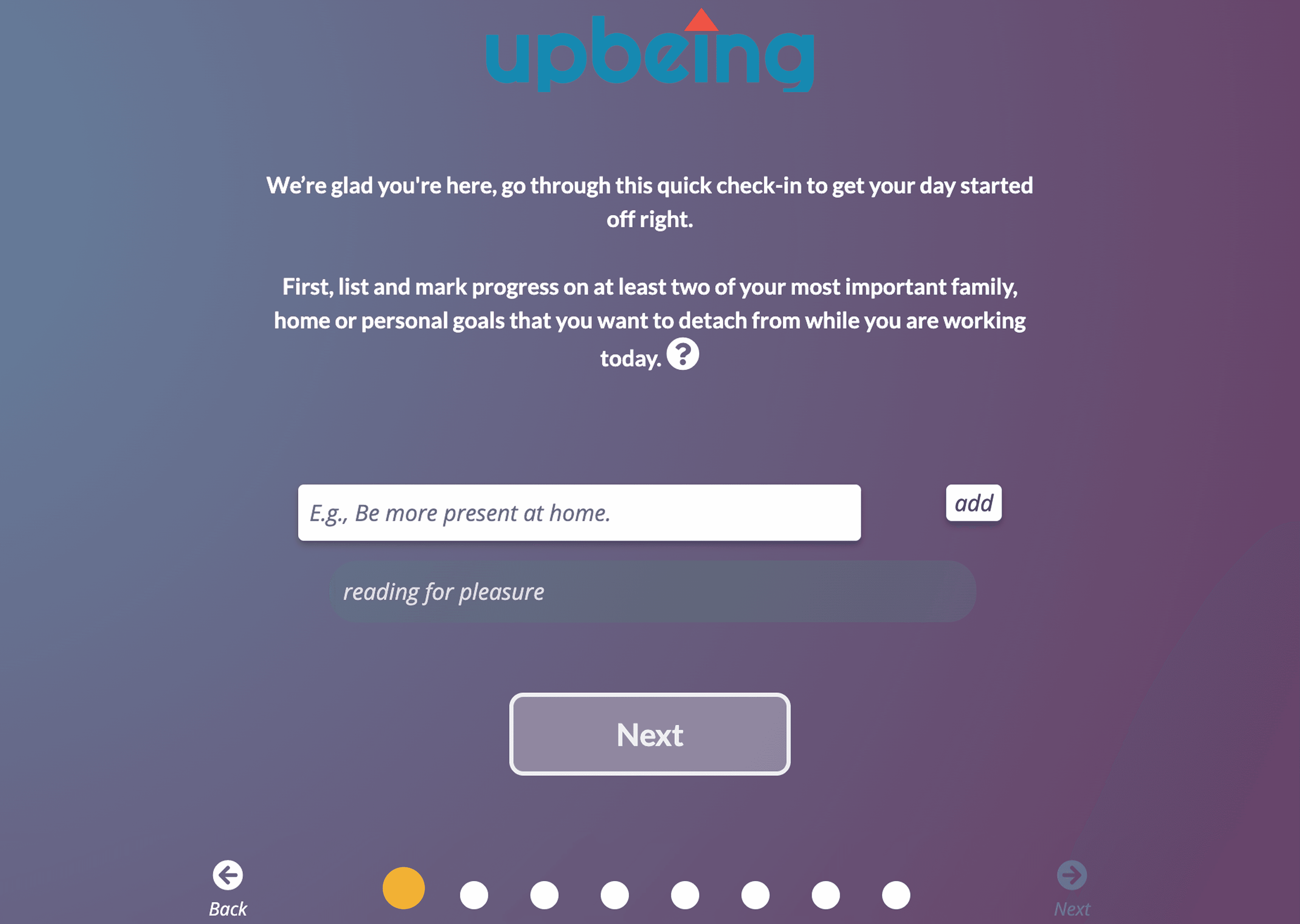
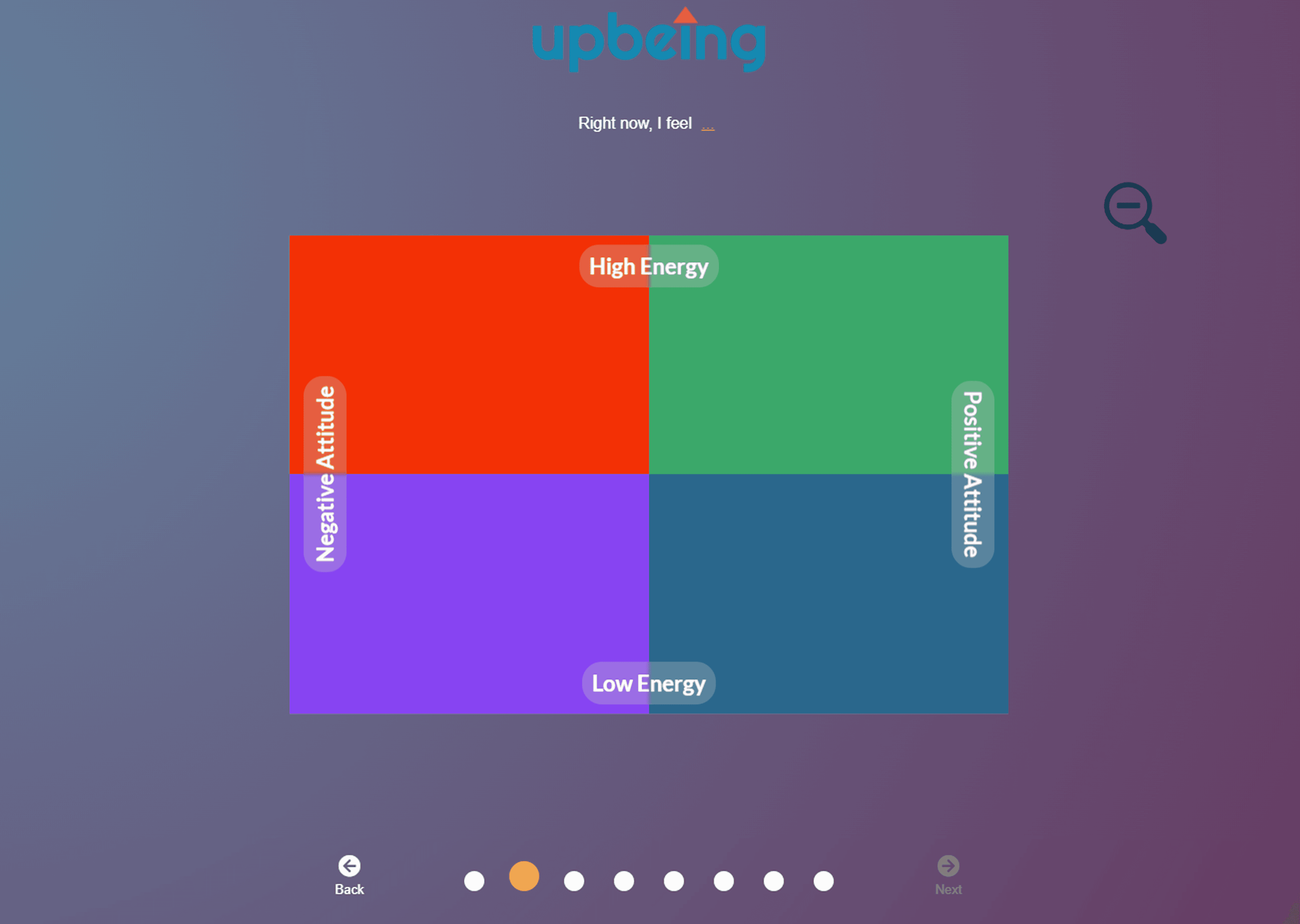
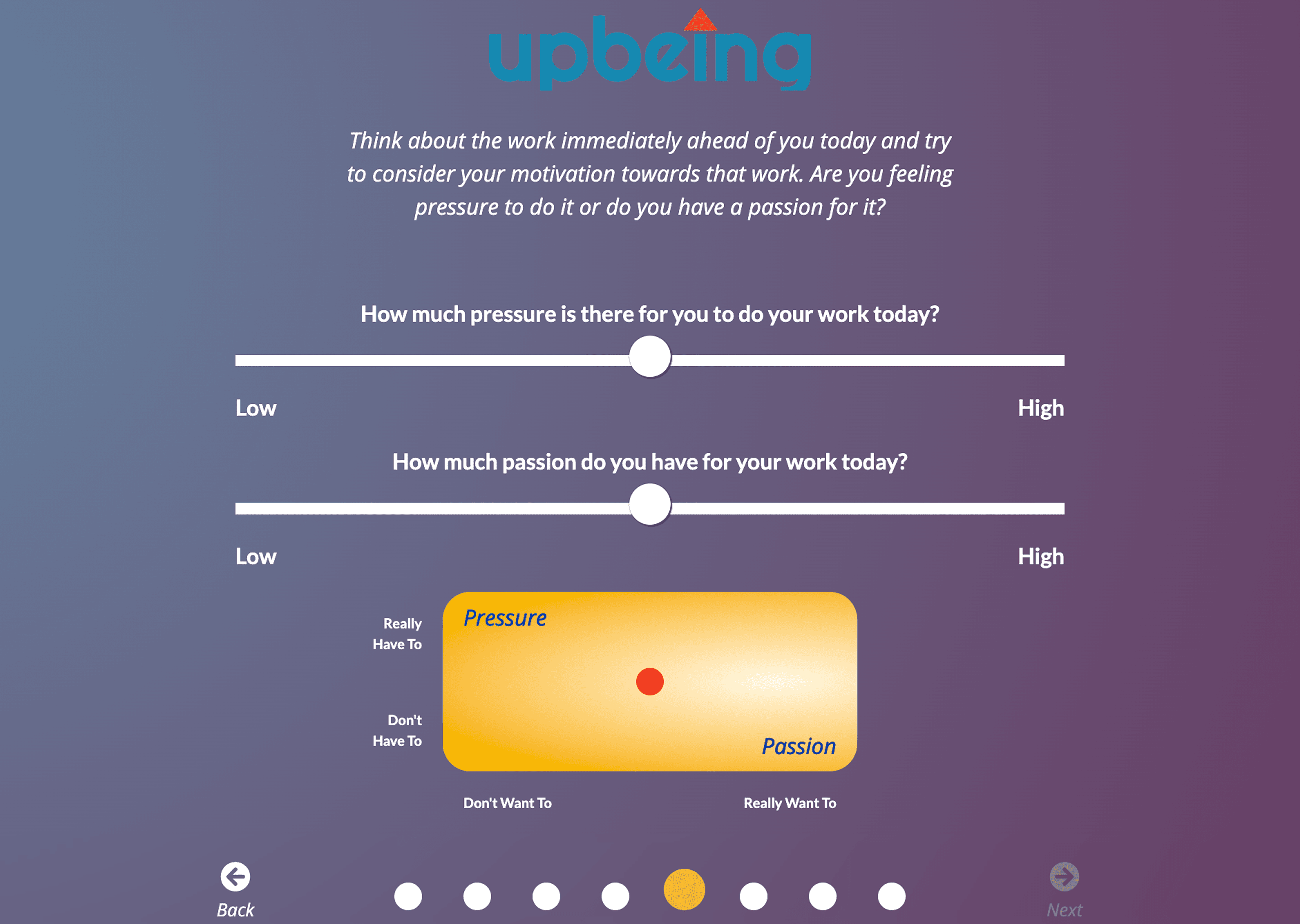
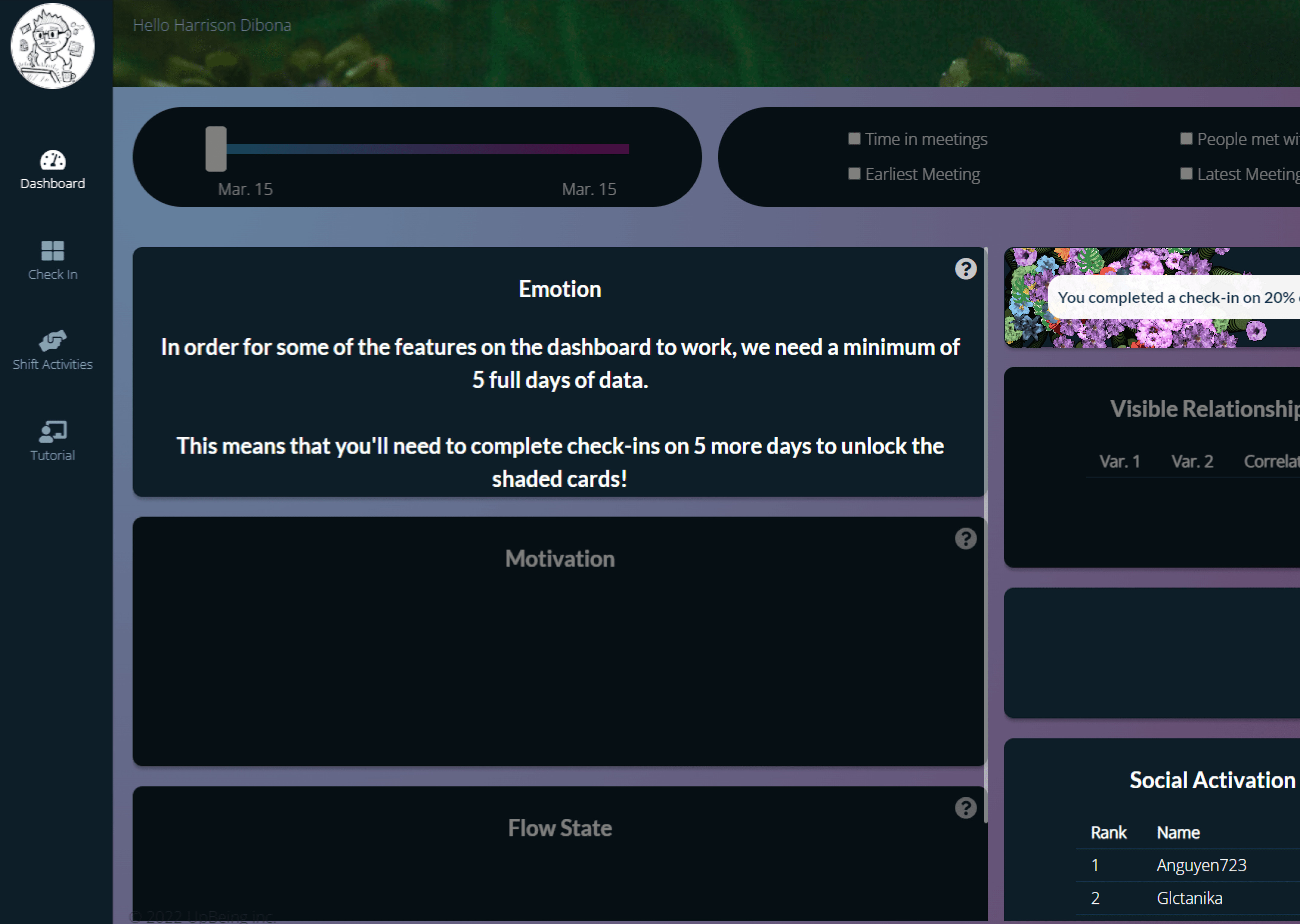
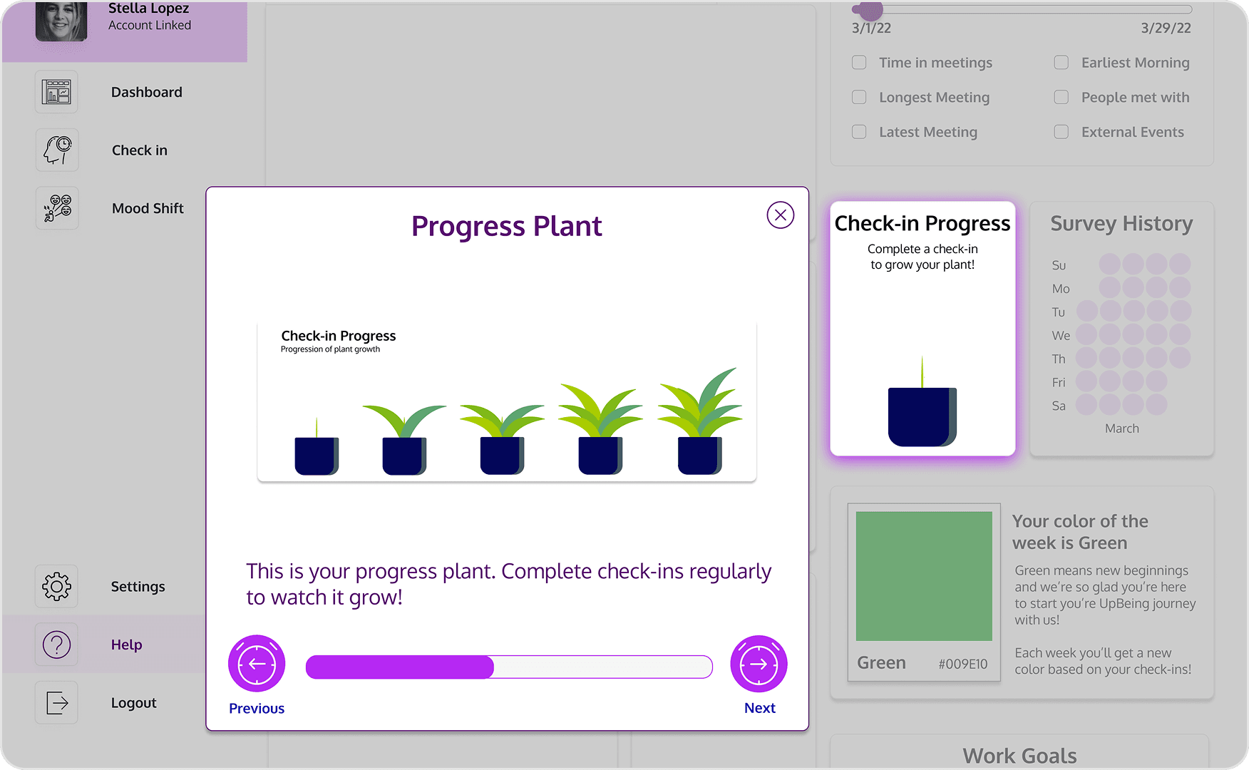
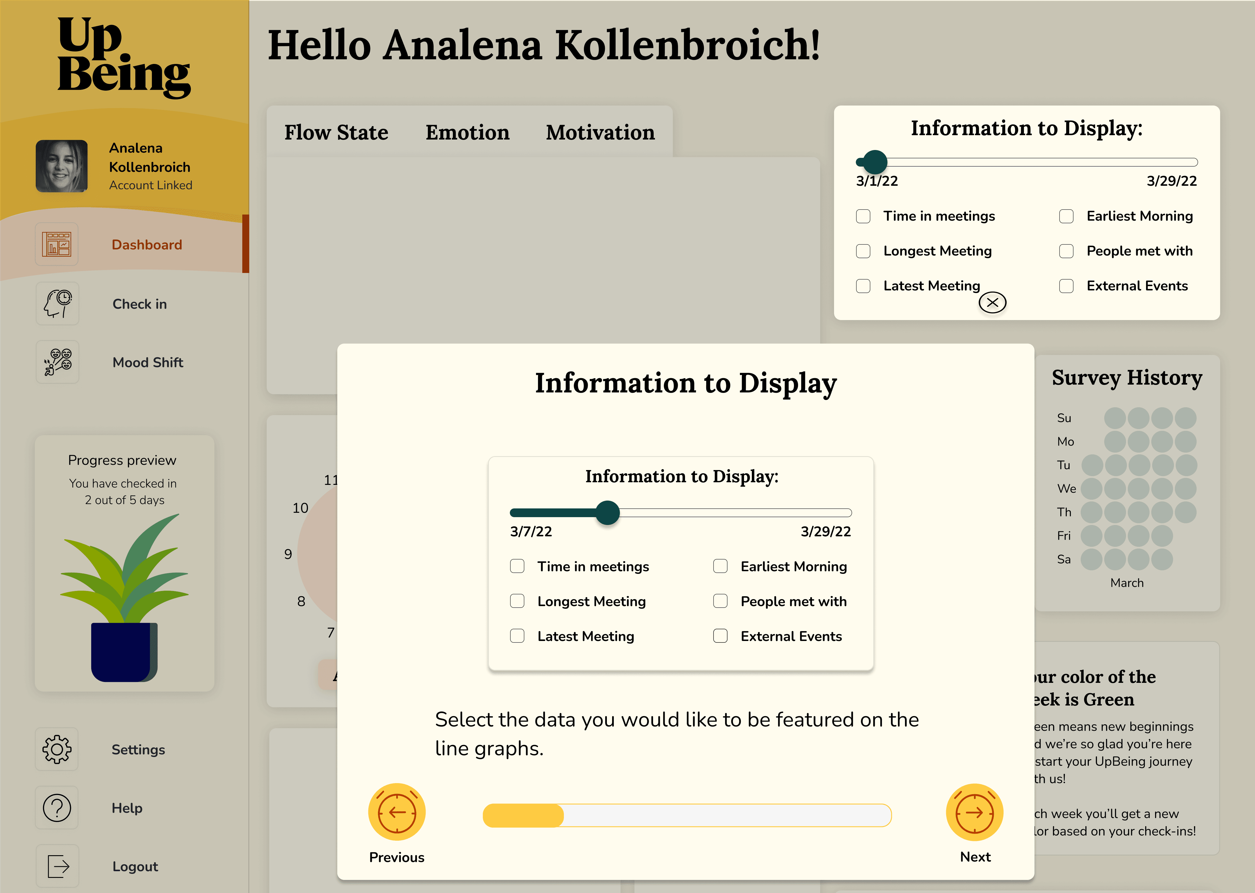
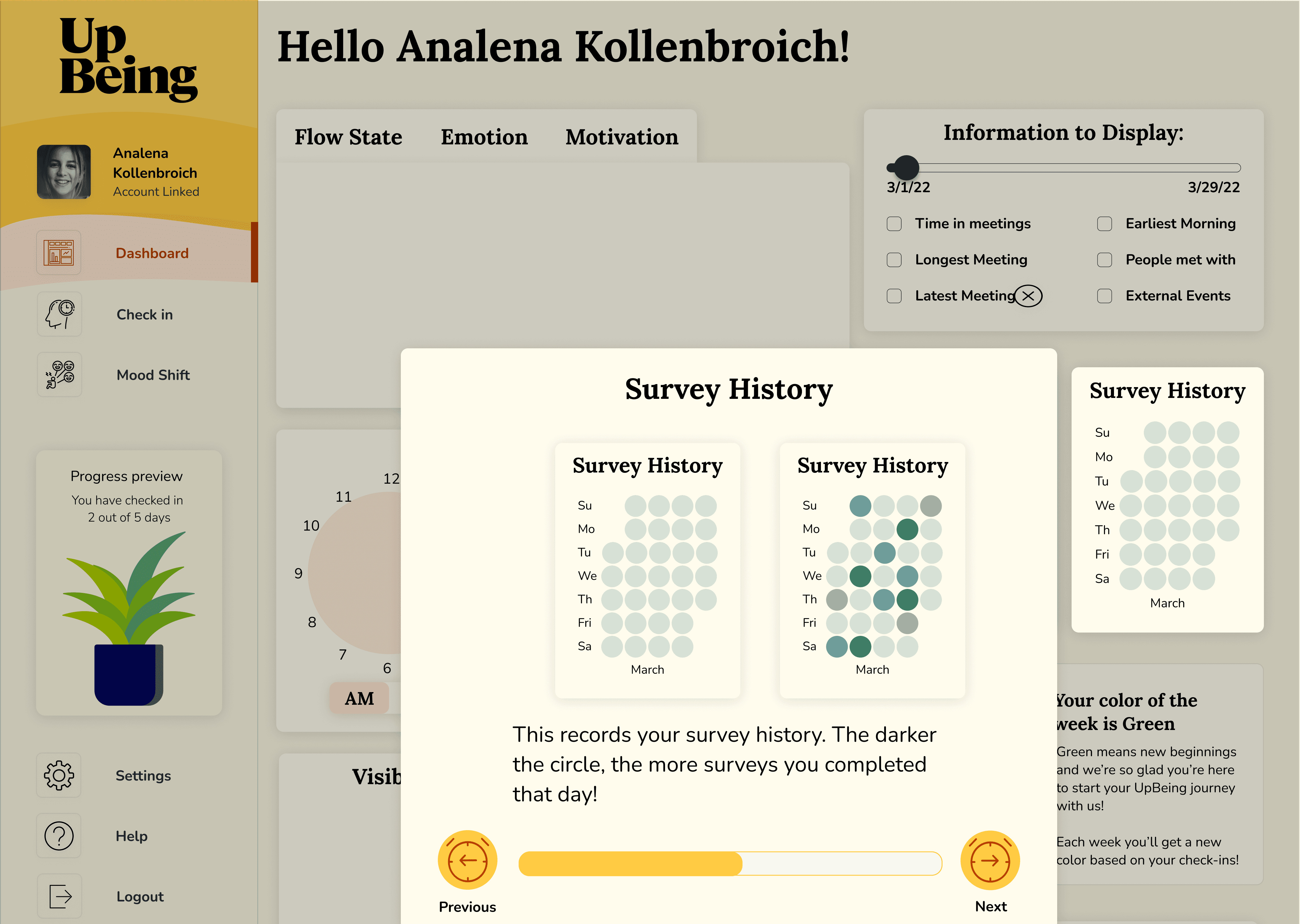
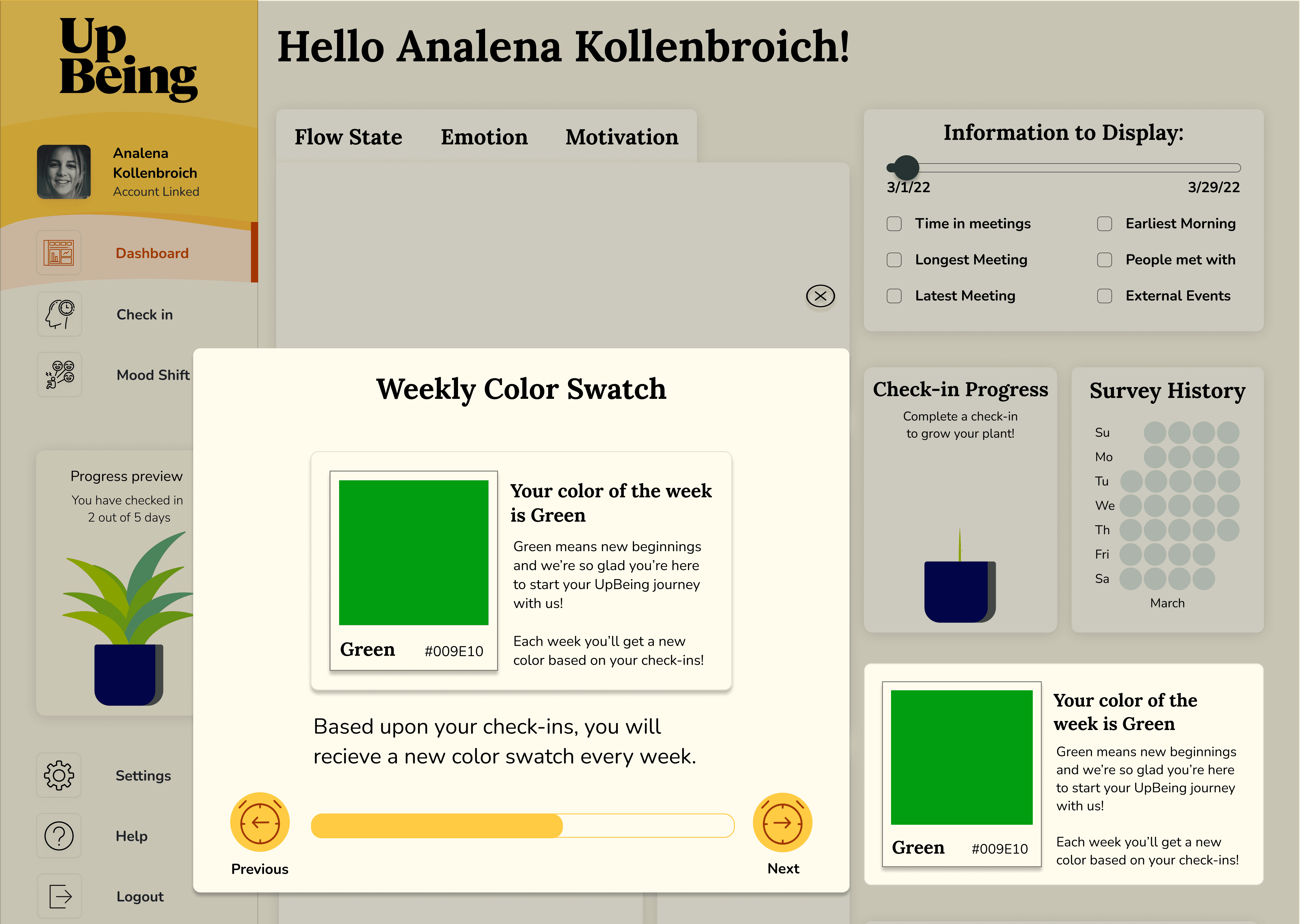
Dashboard tutorials
Dashboard tutorials
Dashboard tutorials
The tutorial flow was redesigned to support user onboarding via the following:
Maximized displays for comprehension.
Overlays to highlight widgets and details.
Illustrations as reference and user-delight.
Progress bars to set sequence awareness.
The tutorial flow was redesigned to support user onboarding via the following:
Maximized displays for comprehension.
Overlays to highlight widgets and details.
Illustrations as reference and user-delight.
Progress bars to set sequence awareness.
The tutorial flow was redesigned to support user onboarding via the following:
Maximized displays for comprehension.
Overlays to highlight widgets and details.
Illustrations as reference and user-delight.
Progress bars to set sequence awareness.
Iterations & outcomes
Iterations & outcomes
Iterations & outcomes
The designs underwent a progressive evolution due to an internal branding redirection. To reflect those changes, the styling of the interface pivoted to align with the product vision.
The designs underwent a progressive evolution due to an internal branding redirection. To reflect those changes, the styling of the interface pivoted to align with the product vision.
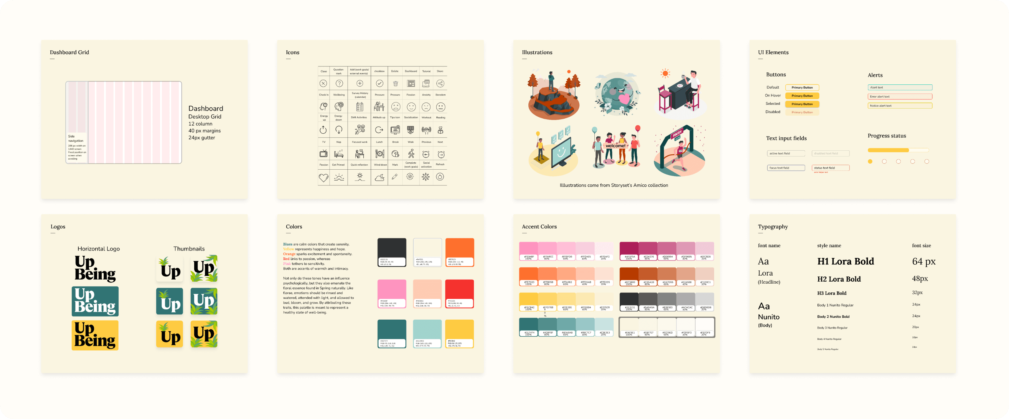
Redesigned style guide
Redesigned style guide
Redesigned style guide
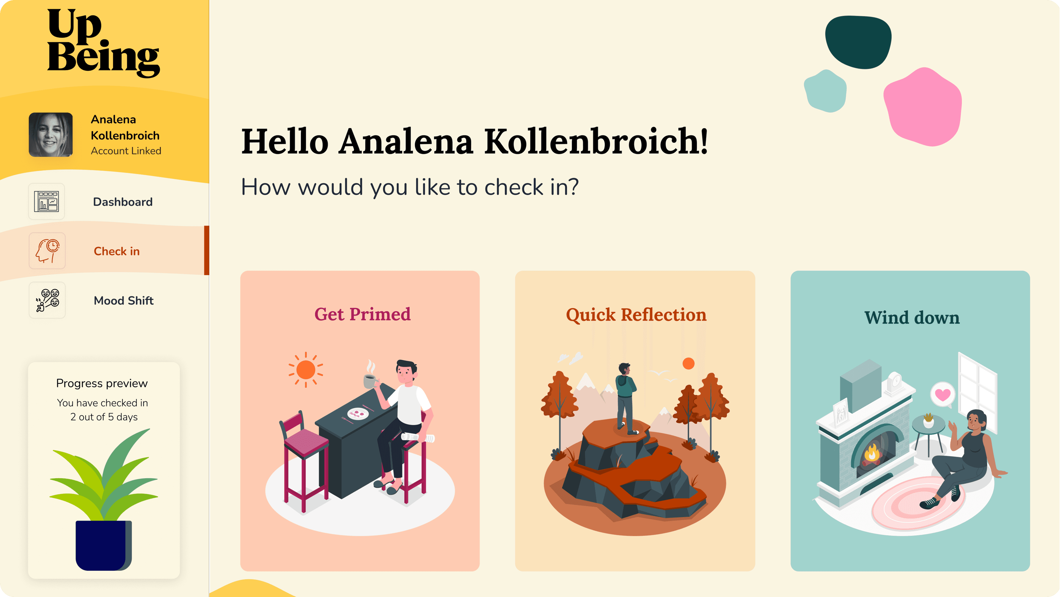
Redesigned mood shift activities workflow
Redesigned mood shift activities workflow
Redesigned mood shift activities workflow
Maintained UX consistency across Mood Shift workflows during interface updates.
Maintained UX consistency across Mood Shift workflows during interface updates.
Maintained UX consistency across Mood Shift workflows during interface updates.


Redesigned dashboard tutorials
Redesigned dashboard tutorials
Redesigned dashboard tutorials
This iteration unified the dashboard tutorial experience. The visuals were aligned with the updated style system. The spacing and UI layout was standardized for consistency. And the walkthrough flow was refined to improve user orientation.
This iteration unified the dashboard tutorial experience. The visuals were aligned with the updated style system. The spacing and UI layout was standardized for consistency. And the walkthrough flow was refined to improve user orientation.
This iteration unified the dashboard tutorial experience. The visuals were aligned with the updated style system. The spacing and UI layout was standardized for consistency. And the walkthrough flow was refined to improve user orientation.


Impacts & learnings
Impacts & learnings
Impacts & learnings
“On behalf of the team at UpBeing, I would like to thank you for the thoughtful designs and hard work!”
“On behalf of the team at UpBeing, I would like to thank you for the thoughtful designs and hard work!”
“On behalf of the team at UpBeing, I would like to thank you for the thoughtful designs and hard work!”
Sean Kortschot, Co-founder of UpBeing
Sean Kortschot, Co-founder of UpBeing
Sean Kortschot, Co-founder of UpBeing
The redesign clarified how users engaged with emotional data, making reflection feel more approachable and sustainable through lightweight interactions and clearer visual hierarchy. As a product, UpBeing emerged with a more cohesive design system that supported trust, accessibility, and future iteration while maintaining its human-centered voice. It led to the company successfully launching the rebranded app into the wellness space.
The redesign clarified how users engaged with emotional data, making reflection feel more approachable and sustainable through lightweight interactions and clearer visual hierarchy. As a product, UpBeing emerged with a more cohesive design system that supported trust, accessibility, and future iteration while maintaining its human-centered voice. It led to the company successfully launching the rebranded app into the wellness space.
The redesign clarified how users engaged with emotional data, making reflection feel more approachable and sustainable through lightweight interactions and clearer visual hierarchy. As a product, UpBeing emerged with a more cohesive design system that supported trust, accessibility, and future iteration while maintaining its human-centered voice. It led to the company successfully launching the rebranded app into the wellness space.