Overview
Overview
Overview
Ensora Health is an EHR platform that supports behavioral health providers with tools for scheduling, documentation, and patient care. As the lead product designer, I led the page standardization initiative by redesigning the scheduling workspace to unify layouts, reduce workflow friction, and modernize the experience across high-traffic modules. The effort improved usability, efficiency, and consistency for both B2B and B2C users.
Ensora Health is an EHR platform that supports behavioral health providers with tools for scheduling, documentation, and patient care. As the lead product designer, I led the page standardization initiative by redesigning the scheduling workspace to unify layouts, reduce workflow friction, and modernize the experience across high-traffic modules. The effort improved usability, efficiency, and consistency for both B2B and B2C users.
Ensora Health is an EHR platform that supports behavioral health providers with tools for scheduling, documentation, and patient care. As the lead product designer, I led the page standardization initiative by redesigning the scheduling workspace to unify layouts, reduce workflow friction, and modernize the experience across high-traffic modules. The effort improved usability, efficiency, and consistency for both B2B and B2C users.
Role
Role
Product designer
Product designer
Timeline
Timeline
2023 - Present
2023 - Present
Platform
Platform
SaaS, Web
SaaS, Web
Team
Team
Cross-functional
Cross-functional
Problem
Problem
Problem

With the current Schedule, both users and businesses faced growing pain points that limited efficiency and satisfaction. The outdated nature of the platform resulted in: inconsistent layouts, user confusion, scheduling errors, and slowed clinic operations.
With the current Schedule, both users and businesses faced growing pain points that limited efficiency and satisfaction. The outdated nature of the platform resulted in: inconsistent layouts, user confusion, scheduling errors, and slowed clinic operations.
With the current Schedule, both users and businesses faced growing pain points that limited efficiency and satisfaction. The outdated nature of the platform resulted in: inconsistent layouts, user confusion, scheduling errors, and slowed clinic operations.
Solution
Solution
Solution


Applying a page standardization to the schedule resulted in consistent layouts across high-traffic pages, clear hierarchy, intuitive controls, faster work processes, and a modernized user experience via a scalable design system.
Applying a page standardization to the schedule resulted in consistent layouts across high-traffic pages, clear hierarchy, intuitive controls, faster work processes, and a modernized user experience via a scalable design system.
Applying a page standardization to the schedule resulted in consistent layouts across high-traffic pages, clear hierarchy, intuitive controls, faster work processes, and a modernized user experience via a scalable design system.
Research & analysis
Research & analysis
Research & analysis
To shape a reusable solution, I worked with our UX researcher on a discovery phase that included:
To shape a reusable solution, I worked with our UX researcher on a discovery phase that included:
To shape a reusable solution, I worked with our UX researcher on a discovery phase that included:
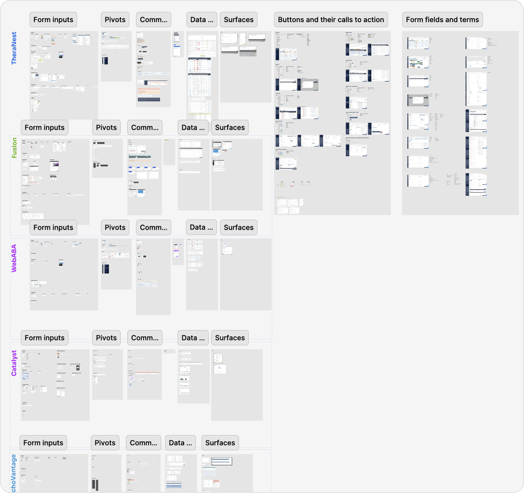
Platform component audit
Platform component audit
Platform component audit
Documented design drift and missing patterns across modules, creating the foundation for a unified design system.
Documented design drift and missing patterns across modules, creating the foundation for a unified design system.
Documented design drift and missing patterns across modules, creating the foundation for a unified design system.
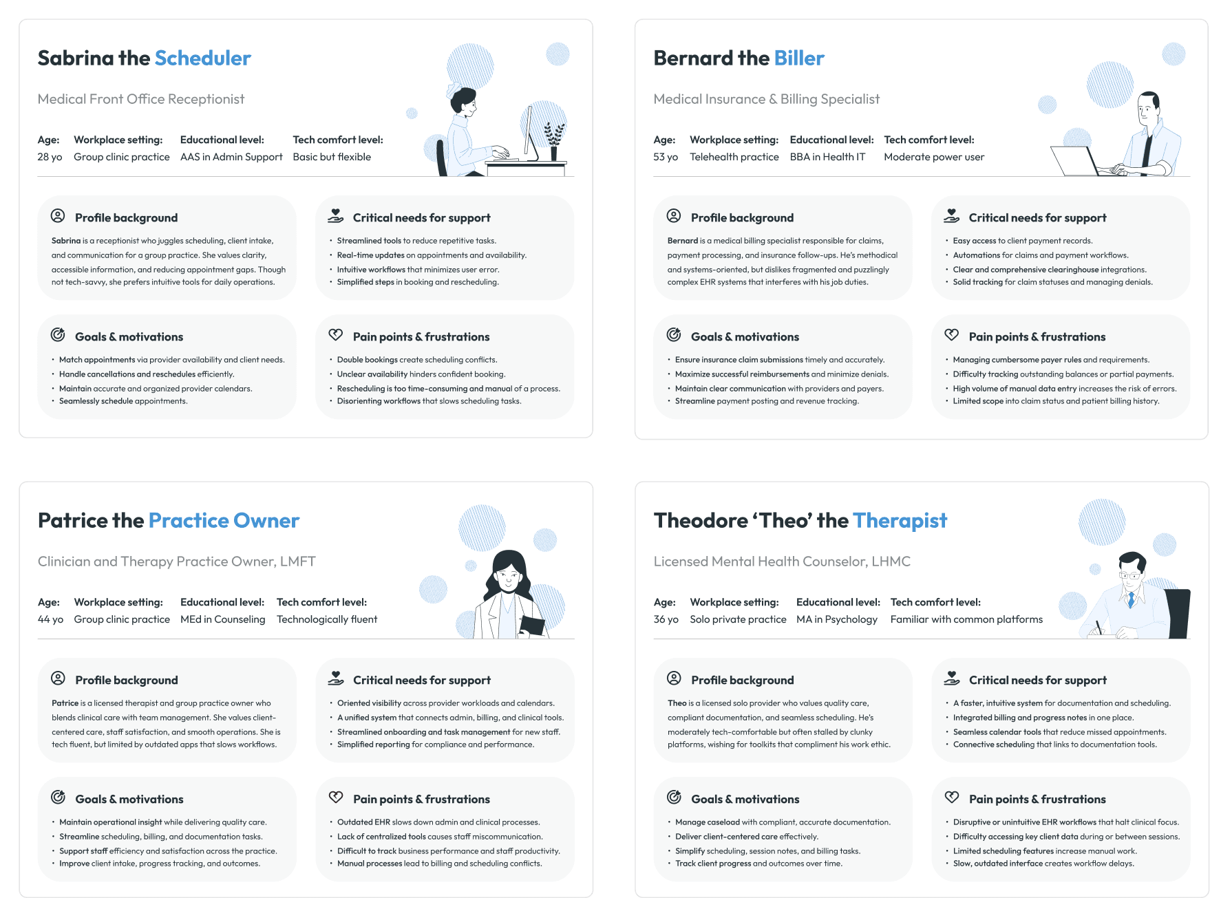
Stakeholder interviews & persona validation
Stakeholder interviews & persona validation
Stakeholder interviews & persona validation
Clarified the most affected roles and aligned the team on core scheduling needs via user personas.
Clarified the most affected roles and aligned the team on core scheduling needs via user personas.
Clarified the most affected roles and aligned the team on core scheduling needs via user personas.
Design approach
Design approach
Design approach
I introduced a workspace model with standardized layouts and explorations:
I introduced a workspace model with standardized layouts and explorations:
I introduced a workspace model with standardized layouts and explorations:
Workspace model
Workspace model
Workspace model
The early workspace model became the foundation for information architecture and navigation.
The early workspace model became the foundation for information architecture and navigation.
The early workspace model became the foundation for information architecture and navigation.
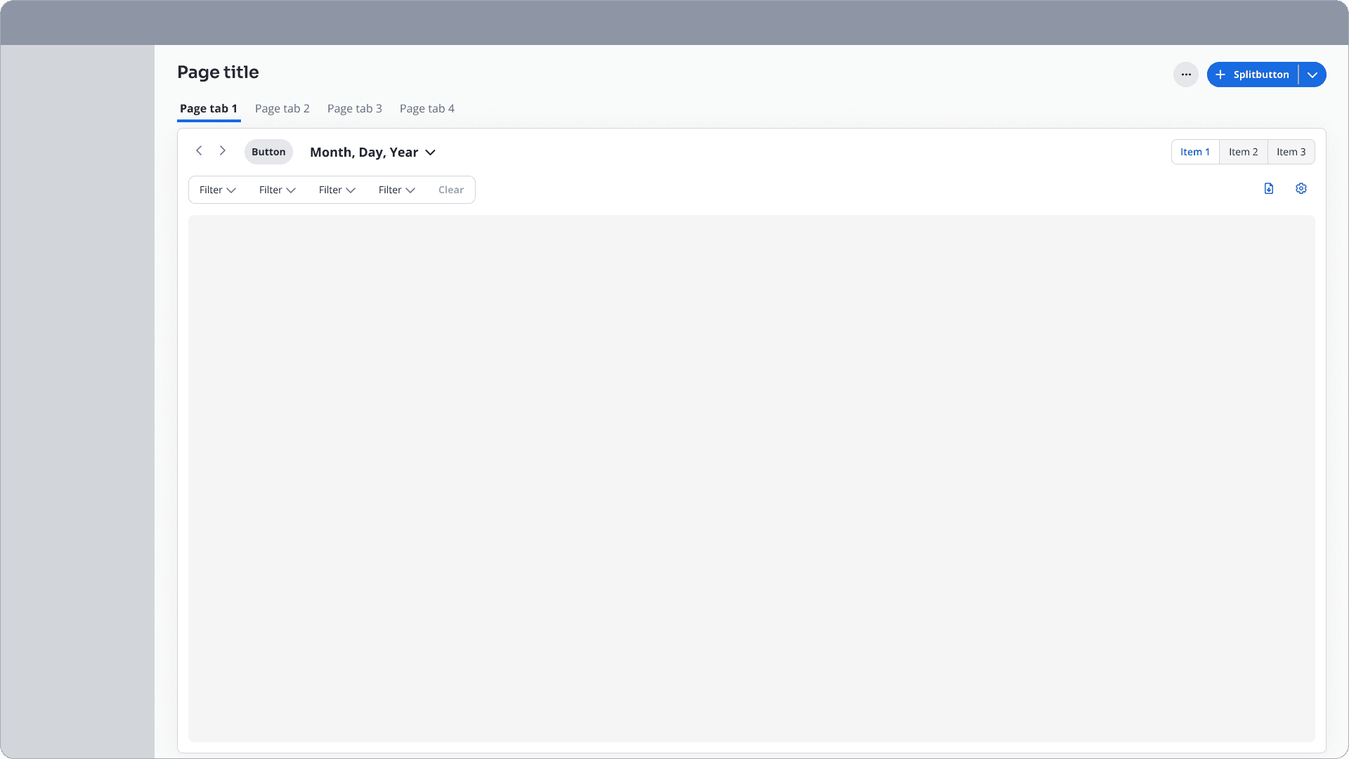
Tools, content, and workflows were grouped into dedicated Workspaces for focus.
Consistent page tabs and global CTAs were introduced for clarity.
Segment controls and contextual buttons were added to support flexibility without overwhelm.
Tools, content, and workflows were grouped into dedicated Workspaces for focus.
Consistent page tabs and global CTAs were introduced for clarity.
Segment controls and contextual buttons were added to support flexibility without overwhelm.
Tools, content, and workflows were grouped into dedicated Workspaces for focus.
Consistent page tabs and global CTAs were introduced for clarity.
Segment controls and contextual buttons were added to support flexibility without overwhelm.
High fidelity explorations
High fidelity explorations
High fidelity explorations
With an understanding of the workspace model and old design layouts, I mocked up high-fidelity explorations to test new page header structures and scalable patterns.
With an understanding of the workspace model and old design layouts, I mocked up high-fidelity explorations to test new page header structures and scalable patterns.
With an understanding of the workspace model and old design layouts, I mocked up high-fidelity explorations to test new page header structures and scalable patterns.
Testing
Testing
Testing
To validate efficiency and clarity across workflows, I conducted usability tests with
16 current + prospective users:
To validate efficiency and clarity across workflows, I conducted usability tests with
16 current + prospective users:
To validate efficiency and clarity across workflows, I conducted usability tests with
16 current + prospective users:
#1: Enhanced the segmented controls to reduce navigation friction between schedule views.
#1: Enhanced the segmented controls to reduce navigation friction between schedule views.
#1: Enhanced the segmented controls to reduce navigation friction between schedule views.
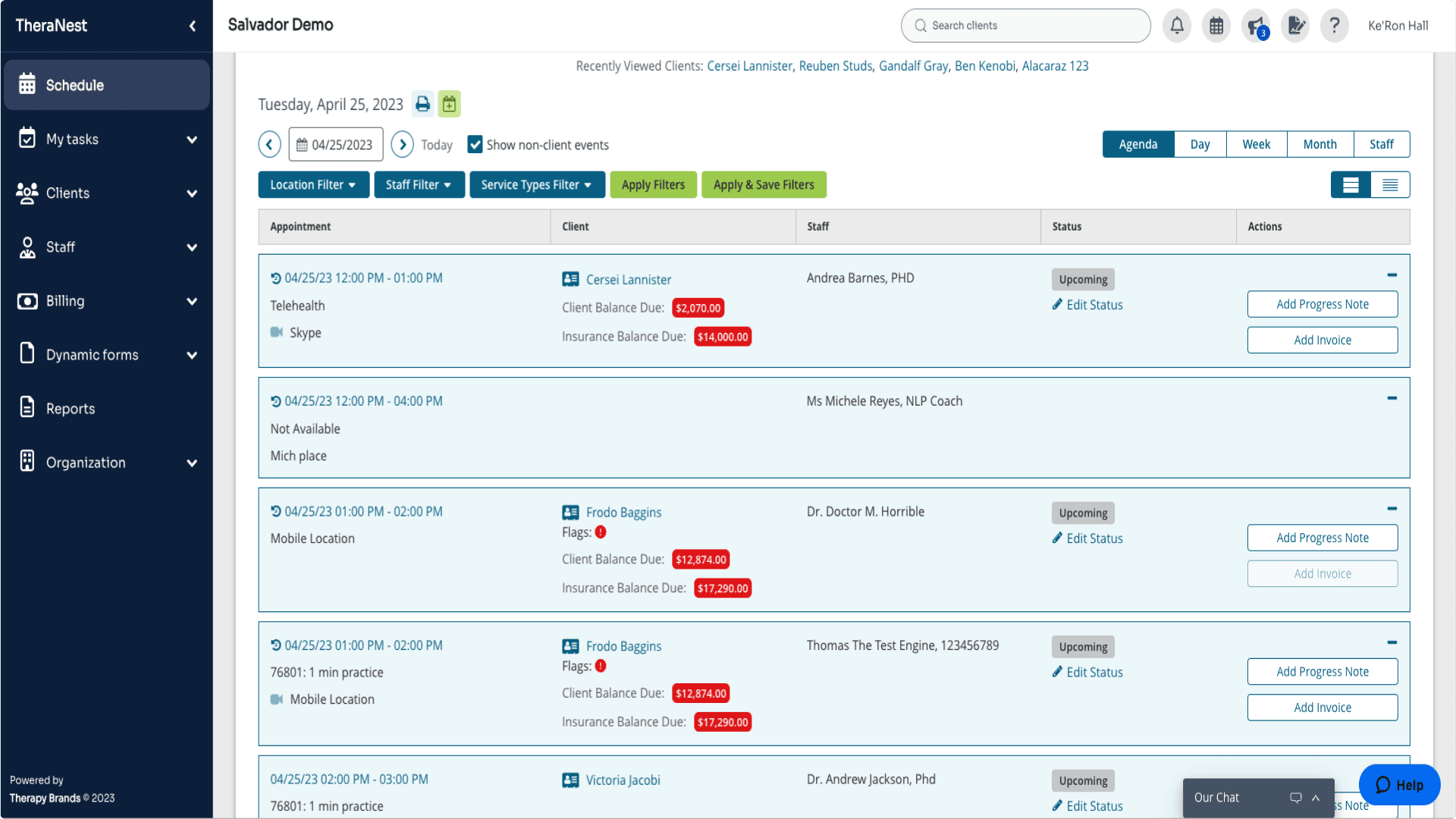
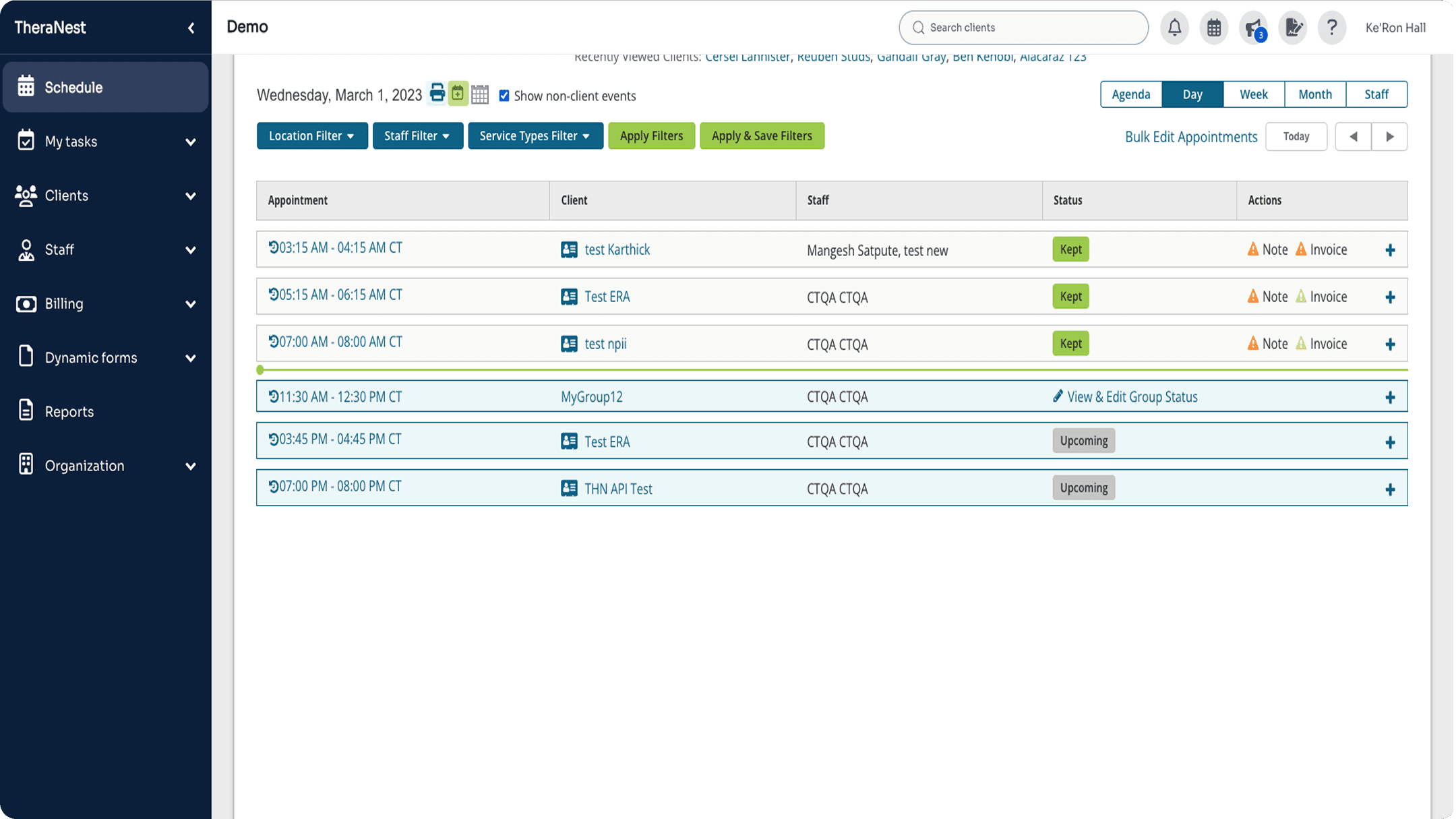
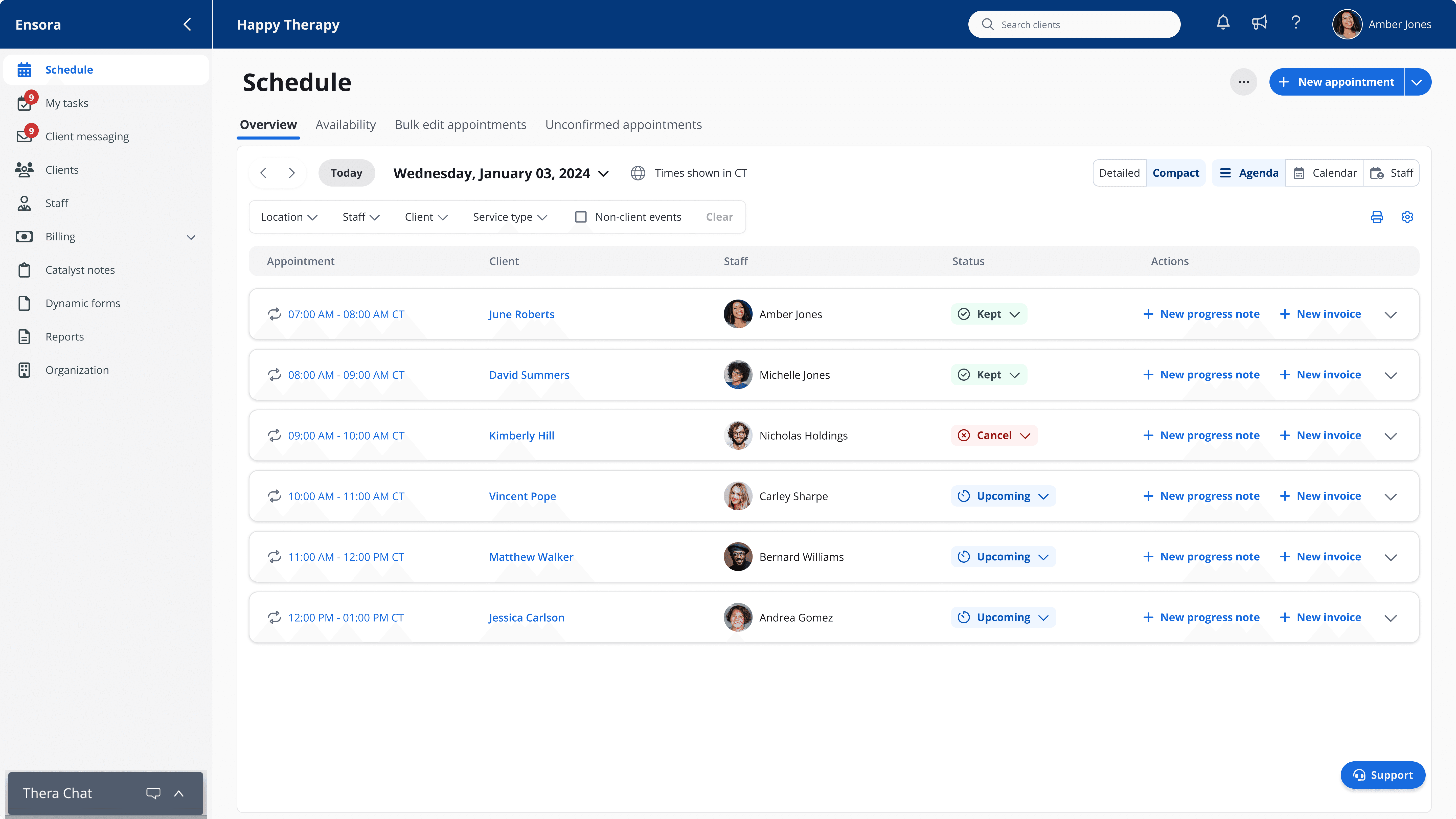
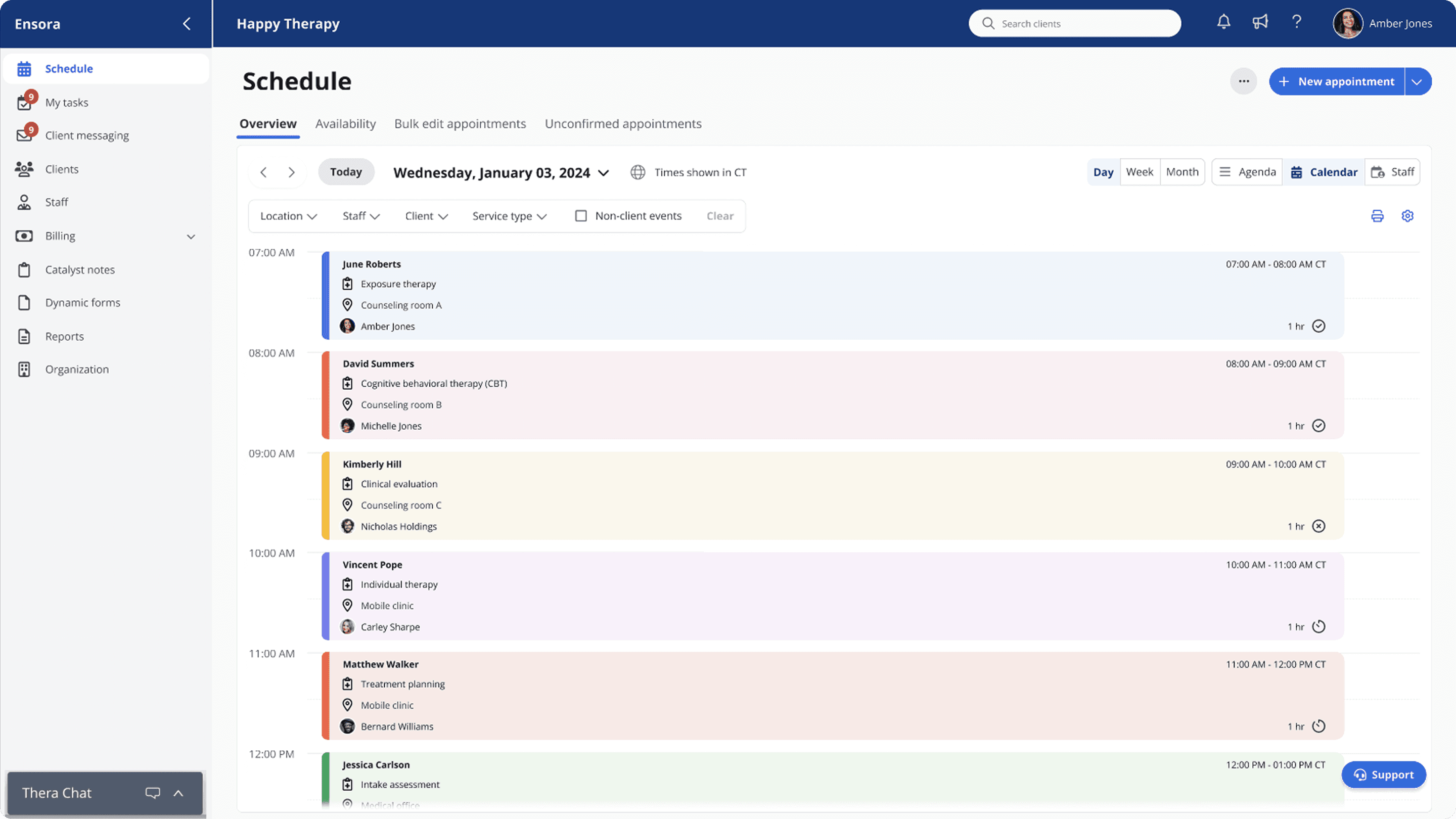
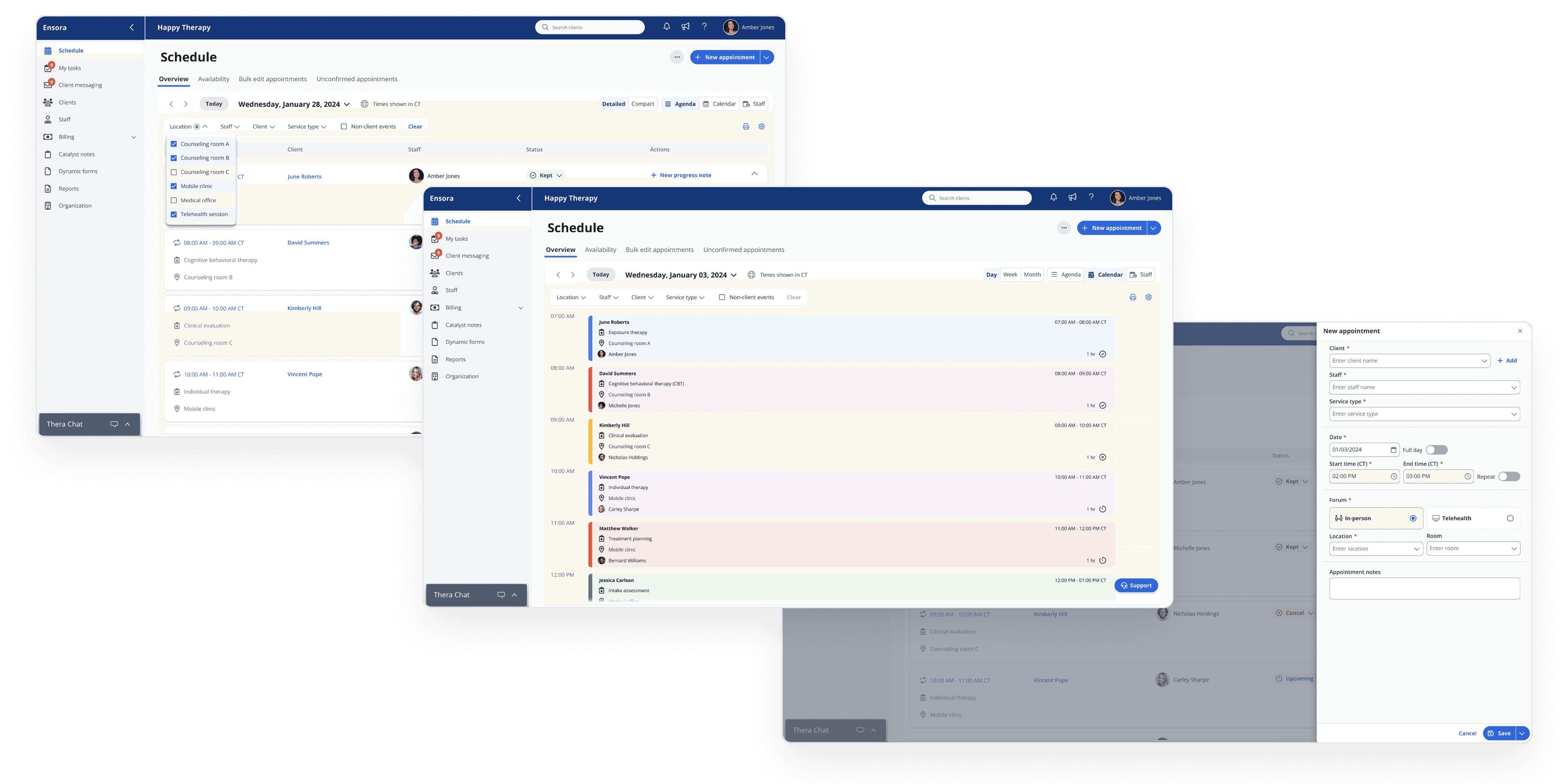
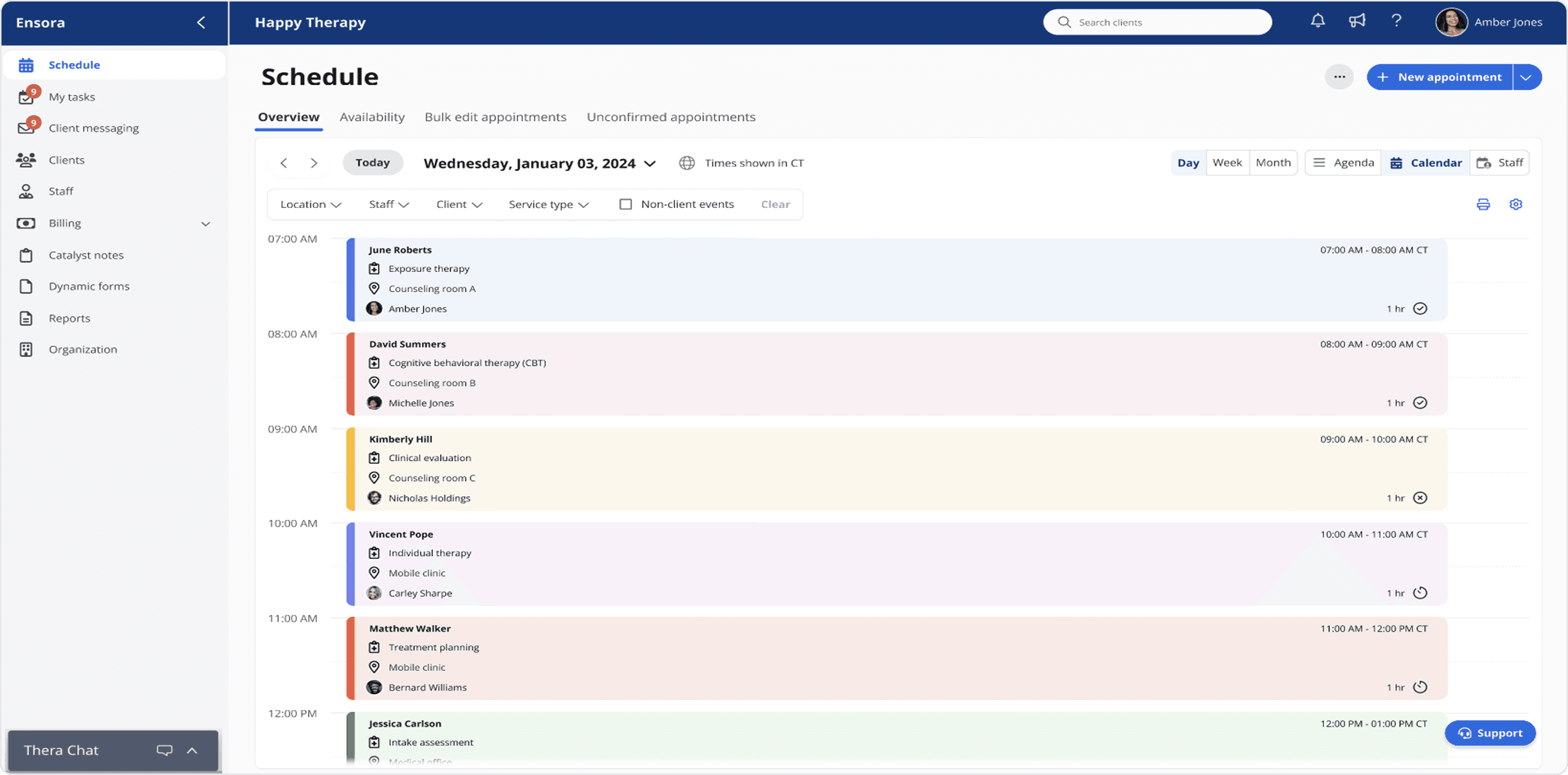
The previous interface interlaced the calendar and agenda views, confusing users and slowing task completion. Separating the two created a more coherent and intuitive experience.
The previous interface interlaced the calendar and agenda views, confusing users and slowing task completion. Separating the two created a more coherent and intuitive experience.
The previous interface interlaced the calendar and agenda views, confusing users and slowing task completion. Separating the two created a more coherent and intuitive experience.
Legacy
Legacy
Legacy
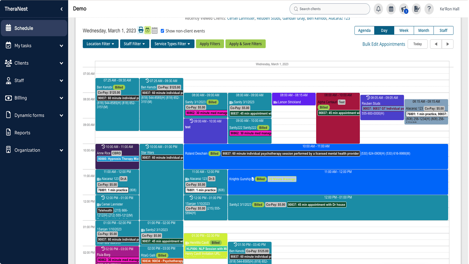
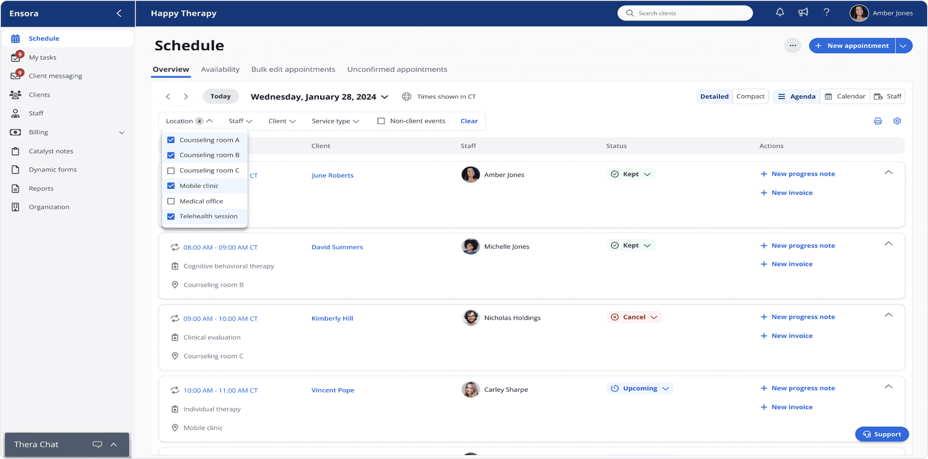
Redesign
Redesign
Redesign
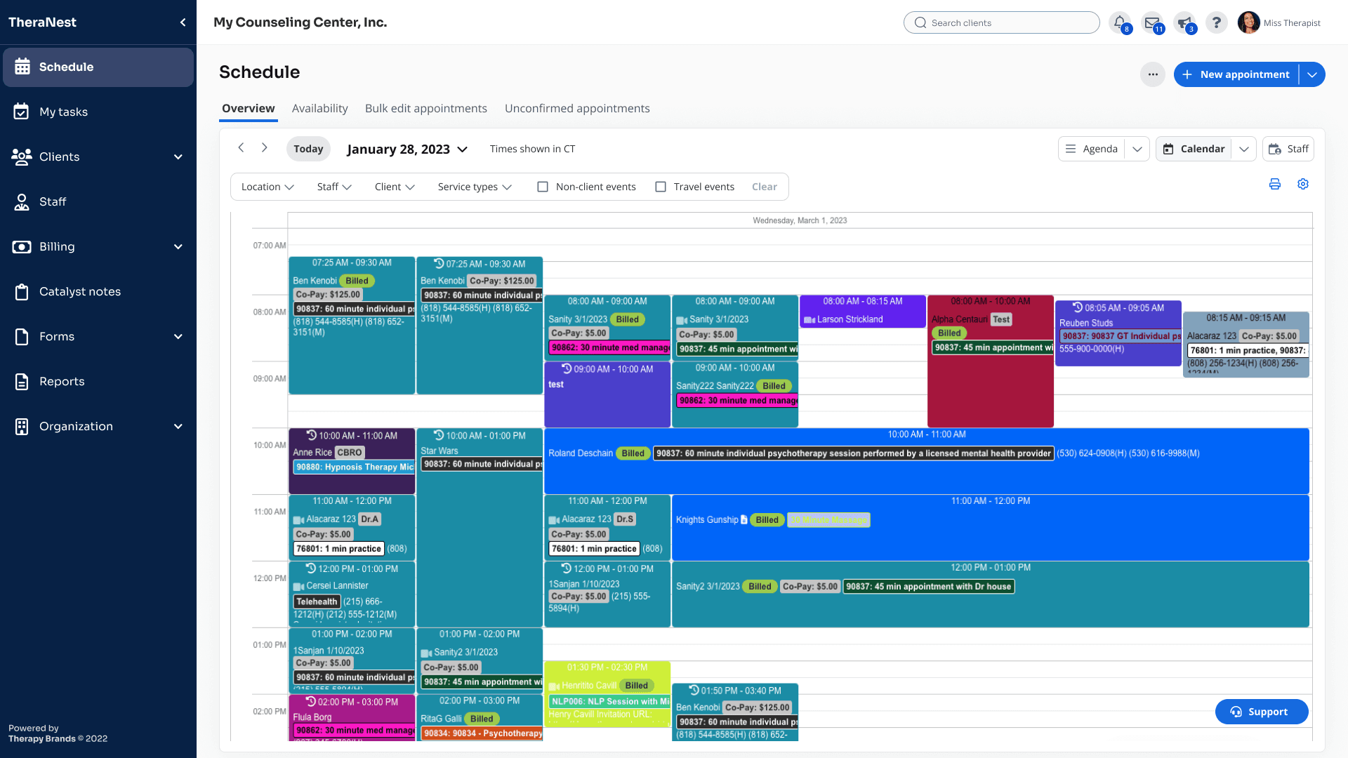
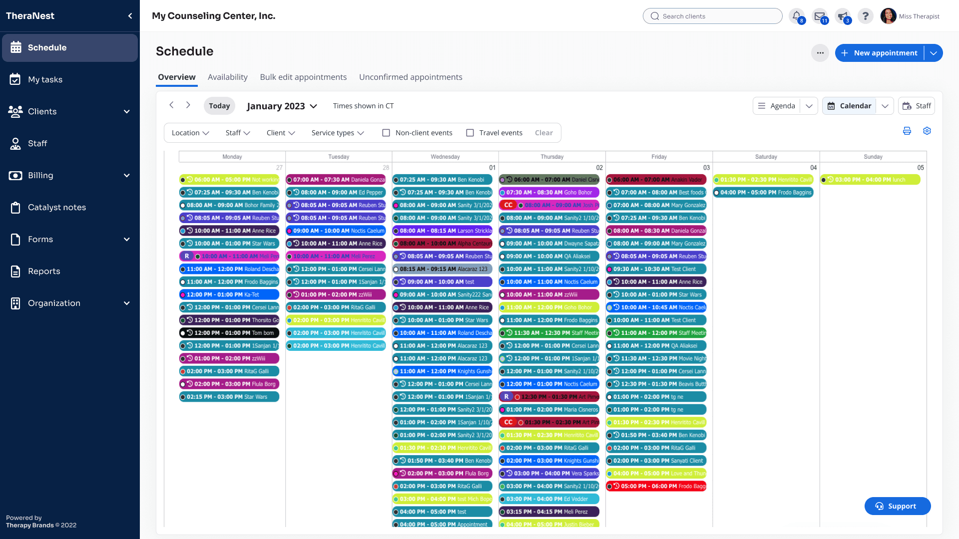
#2: Introduced dynamic filtering to surface schedule data with quicker access and less clicks.
#2: Introduced dynamic filtering to surface schedule data with quicker access and less clicks.
#2: Introduced dynamic filtering to surface schedule data with quicker access and less clicks.
The original feature involved more clicks to manage the filters, resulting in a slower screen update. Automating the filters sped up the process.
The original feature involved more clicks to manage the filters, resulting in a slower screen update. Automating the filters sped up the process.
The original feature involved more clicks to manage the filters, resulting in a slower screen update. Automating the filters sped up the process.
Legacy
Legacy
Legacy

Redesign
Redesign
Redesign
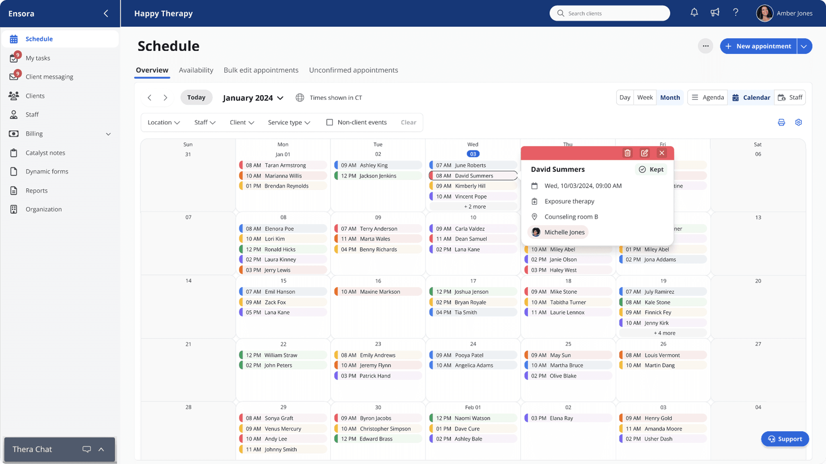
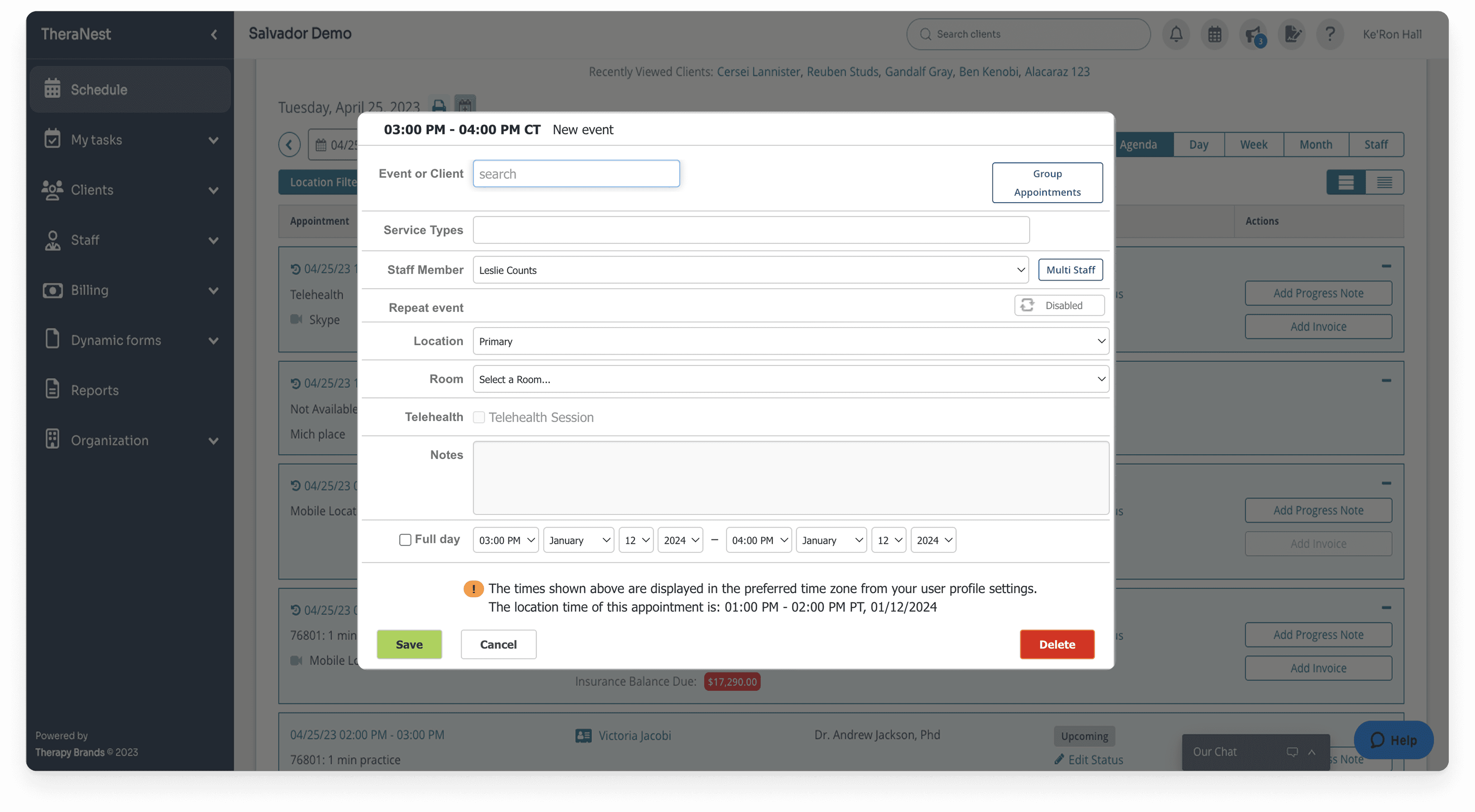
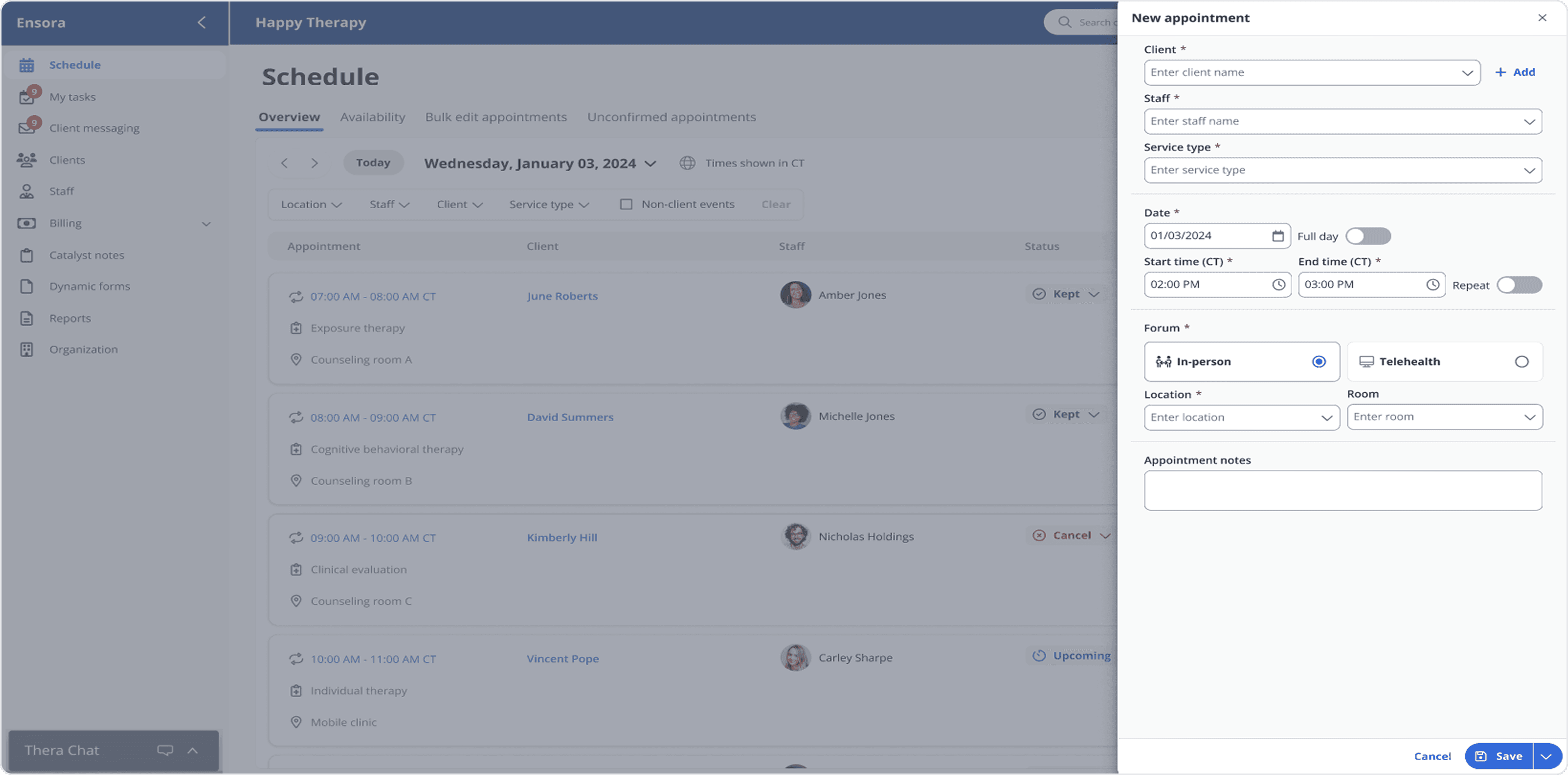
#3: Streamlined the appointment modal for task completion and undisturbed user orientation.
#3: Streamlined the appointment modal for task completion and undisturbed user orientation.
#3: Streamlined the appointment modal for task completion and undisturbed user orientation.
The dated design had small touch targets and a clunky layout, delaying users. The redesign improved discoverability, responsiveness, and alignment with modern scheduling patterns.
The dated design had small touch targets and a clunky layout, delaying users. The redesign improved discoverability, responsiveness, and alignment with modern scheduling patterns.
The dated design had small touch targets and a clunky layout, delaying users. The redesign improved discoverability, responsiveness, and alignment with modern scheduling patterns.
Legacy
Legacy
Legacy
Redesign
Redesign
Redesign
Findings
Findings
Findings
Users described the new structure as intuitive and confidence-boosting.
Navigation was clearer and less cognitively taxing.
Some existing users hesitated at the full visual overhaul, so the team settled on a phased rollout strategy for smoother adoption.
Users described the new structure as intuitive and confidence-boosting.
Navigation was clearer and less cognitively taxing.
Some existing users hesitated at the full visual overhaul, so the team settled on a phased rollout strategy for smoother adoption.
Users described the new structure as intuitive and confidence-boosting.
Navigation was clearer and less cognitively taxing.
Some existing users hesitated at the full visual overhaul, so the team settled on a phased rollout strategy for smoother adoption.
Implementation
Implementation
Implementation
I collaborated with engineers and the design system team to:
Contribute new components (tabs, filters, segment controls, modals).
Ensure behavior was responsive across breakpoints.
Deliver implementation guidance, QA support, and accessibility compliance.
Document updates for future scalability.
I collaborated with engineers and the design system team to:
Contribute new components (tabs, filters, segment controls, modals).
Ensure behavior was responsive across breakpoints.
Deliver implementation guidance, QA support, and accessibility compliance.
Document updates for future scalability.
I collaborated with engineers and the design system team to:
Contribute new components (tabs, filters, segment controls, modals).
Ensure behavior was responsive across breakpoints.
Deliver implementation guidance, QA support, and accessibility compliance.
Document updates for future scalability.
Impacts & learnings
Impacts & learnings
Impacts & learnings
92%
92%
92%
Satisfaction with the new interface
Satisfaction with the new interface
Satisfaction with the new interface
40%
40%
40%
Faster appointment booking
Faster appointment booking
Faster appointment booking
2x
2x
2x
Speed increase in task completion
Speed increase in task completion
Speed increase in task completion
The project validated the workspace model as scalable and set the foundation for standardization across other modules. It also showed that guiding users through change was as critical as the redesign itself. Even though the rework would take time, the vision directed the heading of the product. The experience reinforced the value of empathy, phased adoption, and balancing innovation with user familiarity in healthcare design.
The project validated the workspace model as scalable and set the foundation for standardization across other modules. It also showed that guiding users through change was as critical as the redesign itself. Even though the rework would take time, the vision directed the heading of the product. The experience reinforced the value of empathy, phased adoption, and balancing innovation with user familiarity in healthcare design.
The project validated the workspace model as scalable and set the foundation for standardization across other modules. It also showed that guiding users through change was as critical as the redesign itself. Even though the rework would take time, the vision directed the heading of the product. The experience reinforced the value of empathy, phased adoption, and balancing innovation with user familiarity in healthcare design.